DevFest Bari presents
BACK<
TOCSS
a Web Standards movie

Emiliano Pisu
Father of 2 lovely "monsters"
D&D master, player ... whatever
Senior Design Engineer, Sensei & Co-Host
@ Dev Dojo IT
 linkedin.com/in/pixu1980
 github.com/pixu1980
 codepen.io/pixu1980
linkedin.com/company/dev-dojo-it/
 youtube.com/@devdojo_it
 twitch.tv/devdojo_it
 @devdojo_it
In the recent times CSS got more than a powerful level-up
We got nesting, variables, @container queries, @view-transitions, native carousels, scroll snapping, advanced math functions, and many many more...
Some of these new features can bring
logic, state, and data to CSS
Are you nuts?
Logic, state and data?
In CSS?
🔥 Hell yeah 🔥
Let's introduce the following new CSS features...
typed attr() function
This will be the HTML state layer
Get and parse attribute typed values directly inside CSS, using the `attr()` functioncustom @function combined with if() function
This will be the CSS logic layer
Allows to implement custom logic within CSSif() function combined with custom properties
This will be the CSS data layer
Bring branching logic to CSS without helper classesCombining them all the dynamic duo (HTML + CSS) becomes a declarative and powerful rendering engine
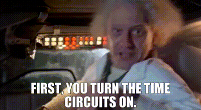
It's "time" to go Back to CSS!
...at 88mph
MONTH
DAY
YEAR
HOUR
MIN
NOV
05
88
1955
8888
AM
PM
06
88
00
88
MONTH
DAY
YEAR
HOUR
MIN
OCT
21
88
1985
8888
AM
PM
01
88
22
88
MONTH
DAY
YEAR
HOUR
MIN
OCT
21
88
1985
8888
AM
PM
01
88
20
88
What is attr()?
Bridges HTML attribute typed values directly in CSS, no JavaScript needed. The DOM becomes the source of truth.The basic syntax
    /* Read any attribute value as a string */
    content: attr(data-label);

    /* Read with a type and fallback */
    width: attr(data-width px, 100px);
Supported Types
Each type tells CSS how to parse and use the attribute value.Supported types include: angle, color, custom-ident, image, integer, length, length-percentage, number, percentage, resolution, string, time, transform-function
Numeric types
    /* Pure number for calculations */
    --speed: attr(data-speed number, 0);

    /* Length units */
    width: attr(data-width px, 100px);
    padding: attr(data-pad em, 1em);
    gap: attr(data-gap rem, 1rem);

    /* Percentage */
    opacity: attr(data-opacity %, 100%);

    /* Angle for rotations */
    rotate: attr(data-angle deg, 0deg);

    /* Time for animations */
    animation-duration: attr(data-duration s, 1s);
Token type for keywords
    /* Token matches exact strings */
    .card {
      --theme: attr(data-theme token, light);
    }

    /* Use with if() for branching */
    background: if(
      attr(data-theme token) = dark,
      #1a1a2e,
      #ffffff
    );
<div data-theme="dark">...</div>
attr() in Calculations
Typed values unlock mathematical operations directly in CSS.Dynamic sizing
<div class="progress" data-value="75"></div>
    .progress {
      --value: attr(data-value number, 0);

      /* Use in calc() */
      width: calc(var(--value) * 1%);

      /* Combine with clamp() */
      opacity: clamp(0.3, var(--value) / 100, 1);

      /* Build complex expressions */
      background: linear-gradient(
        90deg,
        #00f5ff calc(var(--value) * 1%),
        transparent calc(var(--value) * 1%)
      );
    }
Trigonometric functions
<div class="dial" data-angle="45"></div>
    .dial {
      --angle: attr(data-angle deg, 0deg);

      /* Rotation */
      rotate: var(--angle);

      /* Position on a circle */
      --x: calc(cos(var(--angle)) * 50px);
      --y: calc(sin(var(--angle)) * 50px);
      translate: var(--x) var(--y);
    }
HTML as the State Layer
Attributes become your single source of truth. CSS reads, never writes.Bridging to Custom Properties
Store typed attr() values in variables for reuse across the cascade.The pattern
    .component {
      /* Read once at the component root */
      --speed: attr(data-speed number, 0);
      --energy: attr(data-energy number, 1);
      --theme: attr(data-theme token, light);
    }

    /* Descendants inherit and use */
    .component .gauge {
      width: calc(var(--speed) * 1px);
    }

    .component .glow {
      box-shadow: 0 0 calc(var(--energy) * 10px) cyan;
    }

    .component .label {
      color: if(var(--theme) = dark, white, black);
    }
Scoped inheritance
    <div class="card" data-energy="0.8">
      <header>Low power mode</header>
      <div class="glow"></div>
    </div>

    <div class="card" data-energy="1.6">
      <header>High power mode</header>
      <div class="glow"></div>
    </div>
Each card reads its own data-energy. Children inherit the scoped value. No prop drilling. No JavaScript.
What is if()?
Conditional logic in CSS. Choose values based on conditions.The basic syntax
      if(
        condition1: condition1-true-value;
        ...
        conditionX: conditionX-true-value;
        else: default-value
      )
Comparison Operators
Compare numbers, lengths, or match tokens.Simple comparisons
      /* Single <if> */
      color: if(style(--scheme: dark): #eeeeee;)

      background-color: if(media(print): black;)

      margin: if(media(width > 700px): 0 auto;)

      color: if(supports(color: lch(7.1% 60.23 300.16)): lch(7.1% 60.23 300.16);)
Ternary comparisons
      /* <if> with else */
      padding: if(style(--size: "2xl"): 1em; else: 0.25em;)

      color: if(media(print): white; else: black;)

      margin: if(media(width < 700px): 0 auto; else: 20px auto)

      color: if(
        supports(color: lch(7.1% 60.23 300.16)): lch(7.1% 60.23 300.16);
        else: #03045e;
      )

      background-color: if(
        supports(color: lch(75% 0 0)): 3px solid lch(75% 0 0);
        else: 3px solid silver;
      )
Token/String matching
      /* Switch <if>s */
      background: if(
        style(--scheme: ice): linear-gradient(#caf0f8, white, #caf0f8);
        style(--scheme: fire): linear-gradient(#ffc971, white, #ffc971);
        else: none;
      )

      /* <if> within a shorthand */
      border: 3px yellow if(
        style(--color: green): dashed;
        style(--color: yellow): inset;
        else: solid;
      )
if() meets attr()
Read from HTML, branch in CSS. The ultimate reactive pattern.Reactive styling
<button data-loading="true">Submit</button>
    button {
      /* Disable pointer when loading */
      pointer-events: if(
        attr(data-loading token) = true: none;
        else: auto;
      );

      /* Show spinner or text */
      opacity: if(
        attr(data-loading token) = true: 0.6;
        else: 1;
      );
    }

    button::after {
      content: if(
        attr(data-loading token) = true: 'Loading...';
        else: ''
      );
    }
Numeric thresholds
<div class="meter" data-value="85"></div>
    .meter {
      --value: attr(data-value number, 0);

      /* Color by threshold */
      --color: if(
        var(--value) >= 80: #00ff88;
        else: if(
          var(--value) >= 50: #ffaa00,
          else: #ff4444
        )
      );

      background: var(--color);
    }
Nested if() creates multi-level branching.
if() vs Traditional CSS
Fewer selectors, cleaner code, reactive behavior.Before: class based switching
    .button { background: gray; }
    .button.is-primary { background: blue; }
    .button.is-danger { background: red; }
    .button.is-success { background: green; }
    .button.is-warning { background: orange; }
    .button.is-disabled { opacity: 0.5; }
    .button.is-loading { pointer-events: none; }
7 selectors, class management in JS, easier to get out of sync
After: attribute driven with if()
    .button {
      --variant: attr(data-variant token, default);
      --disabled: attr(data-disabled token, false);
      --loading: attr(data-loading token, false);

      background: if(
        var(--variant) = primary: blue;
        var(--variant) = danger: red;
        var(--variant) = success: green;
        var(--variant) = warning: orange;
        else: gray
      );

      opacity: if(
        var(--disabled) = true: 0.5;
        else: 1
      );

      pointer-events: if(
        var(--loading) = true: none;
        else: auto
      );
    }
1 selector only, all logic in CSS, always in sync with HTML state
Powerful Use Cases
From theming to animations, if() handles it all.Dynamic theming
    :root {
      --theme: attr(data-theme token, light);

      --bg: if(
        var(--theme) = dark: #0a0a0f;
        else: #ffffff
      );

      --fg: if(
        var(--theme) = dark: #f0f0f0;
        else: #1a1a1a
      );

      --accent: if(
        var(--theme) = dark: #00f5ff;
        else: #0066cc
      );

      --surface: if(
        var(--theme) = dark: #1a1a2e;
        else: #f9f9f9
      );
    }

    body {
      background: var(--bg);
      color: var(--fg);
    }
Responsive breakpoint values
    .grid {
      --cols: attr(data-cols number, 1);

      /* Clamp columns based on container */
      grid-template-columns: repeat(
        if(
          var(--cols) > 4: 4;
          var(--cols) < 1: 1;
          else: var(--cols)
        ),
        1fr
      );

      /* Adjust gap */
      gap: if(
        var(--cols) >= 3: 2rem;
        else: 1rem
      );
    }
Animation control
    .notification {
      --priority: attr(data-priority token, normal);

      animation-name: if(
        var(--priority) = urgent: pulse-urgent;
        else: fade-in
      );

      animation-duration: if(
        var(--priority) = urgent: 0.3s;
        else: 0.6s
      );

      animation-iteration-count: if(
        var(--priority) = urgent: 3;
        else: 1
      );
    }
What is @function?
Define reusable calculations with parameters and return values.The basic syntax
    @function function-name(--param1, --param2: default) {
      @return /* computed value */;
    }
Like Sass functions, but native to CSS. No build step required.
Parameters and Defaults
Flexible inputs with sensible fallbacks.Required parameters
    /* Simple function with one param */
    @function double(--value) {
      @return calc(var(--value) * 2);
    }

    .box {
      width: double(50px);   /* 100px */
      height: double(3rem);  /* 6rem */
    }
Default values
    /* Spacing function with defaults */
    @function space(--multiplier: 1, --base: 0.5rem) {
      @return calc(var(--multiplier) * var(--base));
    }

    .card {
      padding: space();        /* 0.5rem */
      margin: space(2);        /* 1rem */
      gap: space(4, 0.25rem);  /* 1rem */
    }
Multiple parameters
    /* Fluid sizing with min, preferred, max */
    @function fluid(--min, --preferred, --max) {
      @return clamp(var(--min), var(--preferred), var(--max));
    }

    h1 {
      font-size: fluid(1.5rem, 4vw, 3rem);
    }

    .container {
      width: fluid(300px, 80%, 1200px);
    }
Math Inside Functions
Combine calc(), clamp(), min(), max() for powerful calculations.Calculation chains
    /* Convert pixels to rem */
    @function px-to-rem(--px, --base: 16) {
      @return calc(var(--px) / var(--base) * 1rem);
    }

    /* Percentage of a value */
    @function percent-of(--value, --percent) {
      @return calc(var(--value) * var(--percent) / 100);
    }

    .element {
      font-size: px-to-rem(18);       /* 1.125rem */
      width: percent-of(400px, 75);   /* 300px */
    }
Bounded values
    /* Glow that scales but stays reasonable */
    @function glow-size(--energy, --base: 8px) {
      @return clamp(4px, calc($energy * $base), 48px);
    }

    /* Grid columns with limits */
    @function grid-cols(--count, --min: 1, --max: 6) {
      @return clamp(var(--min), var(--count), var(--max));
    }

    .panel {
      box-shadow: 0 0 glow-size(1.5) cyan;
    }

    .grid {
      grid-template-columns: repeat(grid-cols(8), 1fr);
      /* Results in 6 columns (clamped) */
    }
Trigonometric calculations
    /* Position on a circle */
    @function circle-x(--angle, --radius) {
      @return calc(cos(var(--angle)) * var(--radius));
    }

    @function circle-y(--angle, --radius) {
      @return calc(sin(var(--angle)) * var(--radius));
    }

    .orbit-item {
      --angle: attr(data-angle deg, 0deg);
      --x: circle-x(var(--angle), 100px);
      --y: circle-y(var(--angle), 100px);
      translate: var(--x) var(--y);
    }
@function meets if()
Add conditional logic inside your functions.Conditional returns
    /* Color based on value threshold */
    @function status-color(--value) {
      @return if(
        var(--value) >= 80: #00ff88;
        var(--value) >= 50: #ffaa00;
        else: #ff4444
      );
    }

    .meter {
      --value: attr(data-value number, 0);
      background: status-color(var(--value));
    }
Mode based calculations
    /* Spacing that adapts to density */
    @function adaptive-space(--base, --density) {
      @return if(
        var(--density) = compact: calc(var(--base) * 0.5);
        var(--density) = comfortable: var(--base);
        else: calc(var(--base) * 1.5)
      );
    }

    .list {
      --density: attr(data-density token, normal);
      gap: adaptive-space(1rem, var(--density));
    }
    <ul class="list" data-density="compact">...</ul>
    <ul class="list" data-density="comfortable">...</ul>
Toggle helpers
    /* Boolean to value converter */
    @function when-true(--condition, --value, --fallback: initial) {
      @return if(
        var(--condition) = true: var(--value);
        else: var(--fallback)
      );
    }

    @function when-false(--condition, --value, --fallback: initial) {
      @return if(
        var(--condition) = false: var(--value);
        else: var(--fallback)
      );
    }

    .button {
      --loading: attr(data-loading token, false);
      pointer-events: when-true(var(--loading), none, auto);
      opacity: when-true(var(--loading), 0.6, 1);
    }
Composing Functions
Functions can call other functions. Build complex logic from simple parts.Nesting functions
    /* Base conversion */
    @function to-rem(--px) {
      @return calc(var(--px) / 16 * 1rem);
    }

    /* Fluid sizing using to-rem */
    @function fluid-text(--min-px, --max-px) {
      @return clamp(
        to-rem(var(--min-px)),
        calc(1rem + 2vw),
        to-rem(var(--max-px))
      );
    }

    h1 { font-size: fluid-text(24, 48); }
    h2 { font-size: fluid-text(20, 36); }
    p  { font-size: fluid-text(16, 20); }
Building design systems
    /* Base spacing unit */
    @function space(--n: 1) {
      @return calc(var(--n) * 0.25rem);
    }

    /* Semantic spacing */
    @function gap-sm() { @return space(2); }   /* 0.5rem */
    @function gap-md() { @return space(4); }   /* 1rem */
    @function gap-lg() { @return space(8); }   /* 2rem */
    @function gap-xl() { @return space(16); }  /* 4rem */

    /* Usage */
    .card {
      padding: gap-md();
      margin-bottom: gap-lg();
    }

    .stack {
      gap: gap-sm();
    }
Real world: shadow system
    @function shadow-color(--alpha: 0.1) {
      @return rgba(0, 0, 0, var(--alpha));
    }

    @function shadow(--elevation: 1) {
      @return
        0 calc(var(--elevation) * 1px) calc(var(--elevation) * 2px) shadow-color(0.1),
        0 calc(var(--elevation) * 2px) calc(var(--elevation) * 4px) shadow-color(0.05);
    }

    .card { box-shadow: shadow(2); }
    .modal { box-shadow: shadow(8); }
    .dropdown { box-shadow: shadow(4); }
Powerful Use Cases
From design tokens to animations, functions enable reusable patterns.Color manipulation
    /* Lighten/darken with oklch */
    @function lighten(--color, --amount) {
      @return oklch(from var(--color) calc(l + var(--amount)) c h);
    }

    @function darken(--color, --amount) {
      @return oklch(from var(--color) calc(l - var(--amount)) c h);
    }

    @function alpha(--color, --opacity) {
      @return oklch(from var(--color) l c h / var(--opacity));
    }

    .button {
      --base: #0066cc;
      background: var(--base);
    }

    .button:hover {
      background: lighten(var(--base), 0.1);
    }

    .button:active {
      background: darken(var(--base), 0.1);
    }
Animation helpers
    /* Stagger delay based on index */
    @function stagger(--index, --base: 50ms) {
      @return calc(var(--index) * var(--base));
    }

    /* Easing curves */
    @function ease-out-expo() {
      @return cubic-bezier(0.16, 1, 0.3, 1);
    }

    .list-item {
      --index: attr(data-index number, 0);
      animation: fade-in 0.4s ease-out-expo();
      animation-delay: stagger(var(--index));
    }
Layout calculations
    /* Container width with max */
    @function container(--max: 1200px, --padding: 1rem) {
      @return min(calc(100% - var(--padding) * 2), var(--max));
    }

    /* Aspect ratio box height */
    @function aspect-height(--width, --ratio) {
      @return calc(var(--width) / var(--ratio));
    }

    .wrapper {
      width: container();
      margin-inline: auto;
    }

    .video {
      height: aspect-height(100%, 1.777); /* 16:9 */
    }
Case Studies
So how can we put all this sh... ehm... stuff together?

Case study lessons learned
Three releases, three truths about attribute driven CSS.-
Contracts win
Document data-* invariants and Baseline status next to them. Future teams thank you. -
CSS is logic
attr(), if(), and @function handled 90% of branching. JS only mirrored state. -
Accessibility improves
The same attributes power live regions, toggles, and telemetry strings. Less drift, more clarity.
Wrapping up
HTML attributes become the state layer. CSS attr(), if(), and @function deliver the logic. Together they form a reactive system that flows through the cascade.Pros
- Single source of truth in markup
- No runtime JS for state changes
- Debuggable in DevTools panel
- Zero bundle for UI reactivity
- Progressive enhancement
- Framework agnostic architecture
Cons
- Browser support still incomplete
- Tooling and linter gaps
- Limited logic expressiveness
- Requires @supports fallbacks
- Learning curve for CSS newbies
- Potential debugging issues
Conclusions
The leap from JavaScript driven UI to CSS driven UI is already happening. Start small: pick one component, move state to attributes, and watch the cascade handle the rest.As the flux capacitor powers the time travel, your stylesheets can power the interface.

The UI jumps at 88 mph.
Slides Links


Personal Links


© 1987-2025 - Warner Bros. Entertainment Inc.
Grazie ❤️!