A tale of Style and Motion

Emiliano Pisu
Father of 2 lovely "monsters"
D&D master, player ... whatever
Senior Design Engineer, Sensei & Co-Host
@ Dev Dojo IT
 linkedin.com/in/pixu1980
 github.com/pixu1980
 codepen.io/pixu1980
linkedin.com/company/dev-dojo-it/
 youtube.com/@devdojo_it
 twitch.tv/devdojo_it
 @devdojo_it
Is this a real life?
Is this just fantasy?
Before modern CSS, we had to rely on: weird hacks, pork... ehm... workarounds, techniques that seem absurd today.
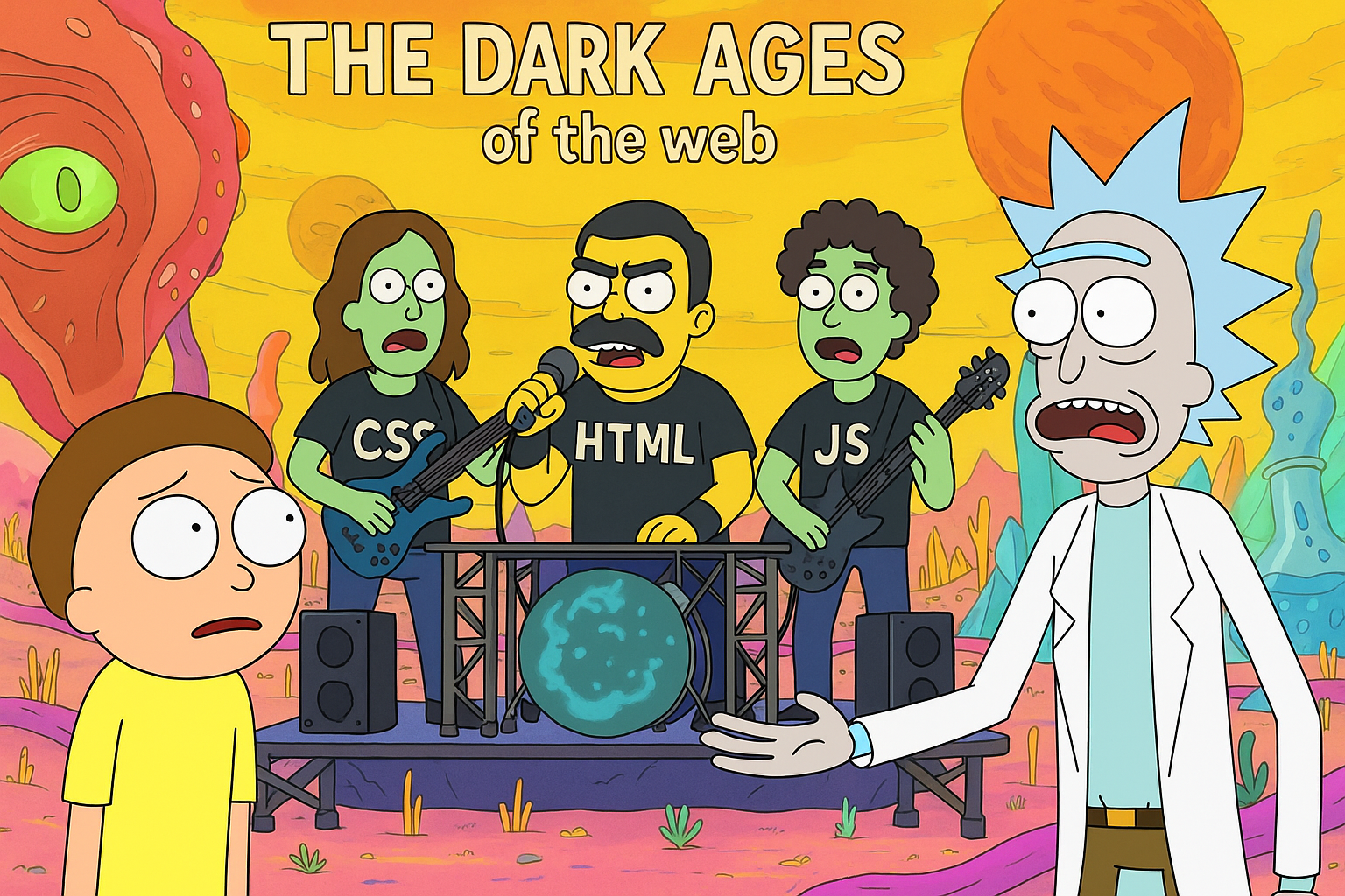
Let's take a nostalgic, and painful, trip down memory lane.
Float & Clear
How we used for "hack" layouts
multi-column layout "challenge"
<div class="container">
  <div class="column">Left</div>
  <div class="column">Center</div>
  <div class="column">Right</div>
  <div class="clearfix"></div>
</div>
the infamous clearfix "hack"
/* The classic clearfix */
.clearfix::before,
.clearfix::after {
  content: "";
  display: table;
}

.clearfix::after {
  clear: both;
}

/* IE6/7 fallback */
.clearfix {
  *zoom: 1;
}
Without clearfix, the parent would collapse! 😱
With clearfix, the parent will not collapse! 😱
it was awful, uh?
- ⚠️ Parent collapse without clearfix
- ⚠️ Percentage calculations = headaches
- ⚠️ No vertical centering
- ⚠️ Float clearing everywhere
- ⚠️ Semantic markup sacrificed
Table Layouts
when Semantics didn't matter
The <table> Abuse
| Sidebar |
Header
Main Content
|
Nested tables within tables! 🤯
<!-- The "layout" -->
<table width="100%" cellpadding="0">
  <tr>
    <td width="200">Sidebar</td>
    <td>
      <table width="100%">
        <tr>
          <td>Header</td>
        </tr>
        <tr>
          <td>Content</td>
        </tr>
      </table>
    </td>
  </tr>
</table>
display: table alternative
.layout {
  display: table;
  width: 100%;
}

.sidebar {
  display: table-cell;
  width: 200px;
  vertical-align: top;
}

.content {
  display: table-cell;
  vertical-align: top;
}
- ⚠️ Still table-thinking for layouts
- ⚠️ Hard to make responsive
- ⚠️ Vertical alignment works... but at what cost?
- ⚠️ No gaps/gutters without spacer elements
- ⚠️ Order changes require HTML changes
slightly better, but still... yawk!
CSS Sprites
The "image optimization" technique
One Image to Rule Them All
the "magic" sprite grid
/* the sprite sheet */
.icon {
  background: url('sprites.png') no-repeat;
  background-position: 0 0;
  display: inline-block;
  width: 32px;
  height: 32px;
}

/* adding classes via JS and
manual pixel calculations */
.icon.icon-hover {
  background-position: -32px 0;
}

.icon.icon-active {
  background-position: -64px 0;
}
this idea leaded to lots of problems
- ⚠️ Add one button → rebuild entire sprite
- ⚠️ Manual pixel calculations
- ⚠️ Hover/Active states = 2/3x the complexity
- ⚠️ Different sizes? More sprites!
- ⚠️ Documentation needed to track positions
Hacks & Workarounds
a "wild west" of browser compatibility
Browser-Specific Nightmares
a minefield of hacks and workarounds- Too different rendering engines
- Box model inconsistencies
- Margin collapsing bugs
- PNG transparency issues
- Z-index nightmares
/* IE6/7 hacks */
* html .selector {
  /* Only IE6 sees this */
  margin: 10px;
}

*+html .selector {
  /* Only IE7 sees this */
  margin: 10px;
}

.selector {
  margin: 20px;
  _margin: 10px; /* IE6 underscore hack */
  *margin: 10px; /* IE6/7 star hack */
}

/* IE conditional comments in CSS */
/* @media \0screen\,screen\9 {
  .selector { margin: 10px; }
} */
Vendor Prefix Hell
- Different prefixes for different browsers
- N times the code for one property
- How and When to drop old prefixes?
- Additional toolchain entries (Autoprefixer?)
.box {
  -webkit-border-radius: 10px;
  -moz-border-radius: 10px;
  -ms-border-radius: 10px;
  -o-border-radius: 10px;
  border-radius: 10px;

  -webkit-box-shadow: 0 2px 4px rgba(0,0,0,0.1);
  -moz-box-shadow: 0 2px 4px rgba(0,0,0,0.1);
  box-shadow: 0 2px 4px rgba(0,0,0,0.1);

  -webkit-transform: rotate(5deg);
  -moz-transform: rotate(5deg);
  -ms-transform: rotate(5deg);
  -o-transform: rotate(5deg);
  transform: rotate(5deg);
}
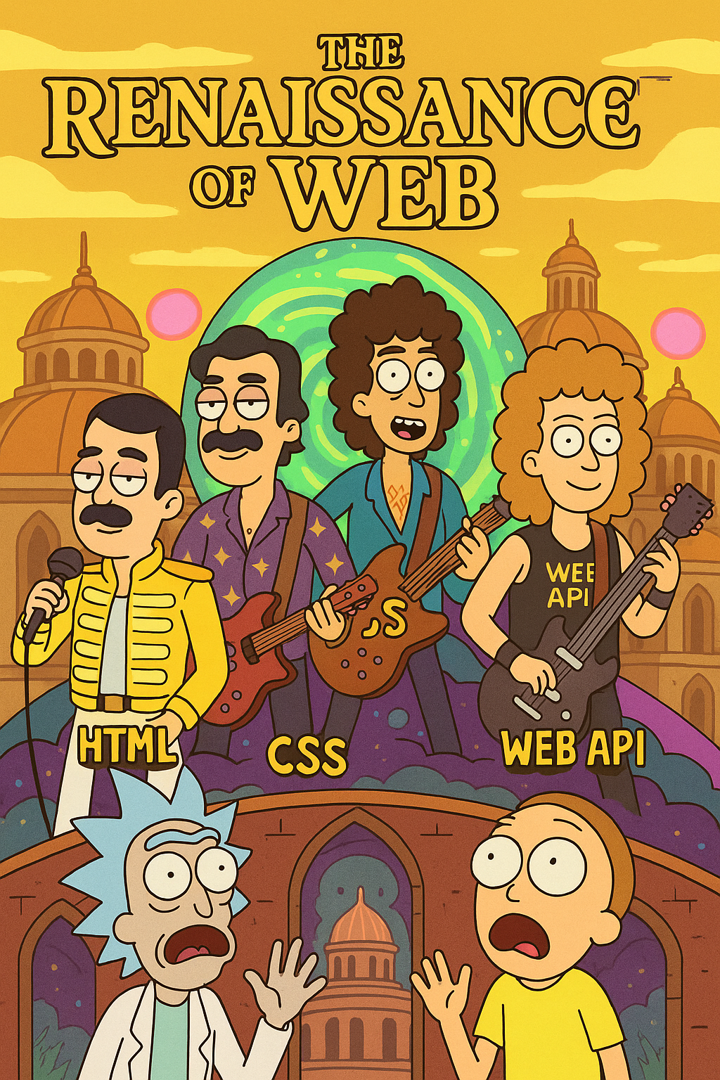
the Advent of Baseline
What is Baseline?
Baseline, officially introduced during the Google I/O 2023, is an initiative, a standard for indicating when web platform features become reliably available across major browsers.
✅ Clear communication about feature support
✅ Helps developers make informed decisions
✅ Tracks features across Chrome, Firefox, Safari, Edge
✅ Updated regularly by web standards organizations
3 simple states for
Web API Availability
 Widely Available
Safe to Use in Production
- Available in Chrome, Firefox, Safari, Edge for 30+ months
- Excellent cross-browser support
- Can be used without fallbacks in most cases
- Recommended for all projects
 Newly Available
Use with Progressive Enhancement
- Available in all major browsers for less than 30 months
- Good modern browser support
- Consider fallbacks for older browsers
- Test thoroughly across browsers
 Limited Availability
Experimental - Use with Caution
- Not available in all major browsers yet
- May require feature flags or polyfills
- Syntax may change
- Best for experiments and prototypes
- Plan for graceful degradation
An example
@container at-rule

Chrome 105    ✅ Sep 2022
Firefox 110   ✅ Feb 2023
Safari 16.0   ✅ Sep 2022
Edge 105      ✅ Sep 2022

Last browser:  Firefox (Feb 2023)
Baseline date: Feb 2023 (Newly Available)
Widely date:   Aug 2025 (Feb 2023 + 30 months)
Decision Framework
| Status | When to Use | Considerations |
|---|---|---|
| Widely |
✅ All projects ✅ Production sites ✅ No fallback needed |
Safe for 95%+ users Minimal testing required |
| Newly |
✅ Modern projects ✅ With fallbacks ⚠️ Check user base |
Use @supports Test older browsers Progressive enhancement |
| Limited |
⚠️ Experiments only ⚠️ With polyfills ⚠️ Feature detection |
Provide fallbacks Syntax may change Limited browser support |
Checking Baseline Status
- Visit web.dev/baseline
- Check MDN browser compatibility tables
- Look for Baseline badges in documentation
- Use
@supportsfor feature detection
From painful hacks to powerful features ✨
CSS Custom Properties (Variables) 🎨
Widely Available (April 2017)
Theme System
This card adapts to the theme using CSS custom properties.
:root {
  /* Light theme (default) */
  --bg-primary: #ffffff;
  --bg-secondary: #f3f4f6;
  --text-primary: #1f2937;
  --text-secondary: #6b7280;
  --border-color: #e5e7eb;
}

[data-theme="dark"] {
  /* Dark theme */
  --bg-primary: #1f2937;
  --bg-secondary: #111827;
  --text-primary: #f9fafb;
  --text-secondary: #d1d5db;
  --border-color: #374151;
}

/* Components automatically adapt */
.card {
  background: var(--bg-primary);
  color: var(--text-primary);
  border: 1px solid var(--border-color);
}
Flexbox
Widely Available (September 2015)
From Float Hell to Flex Heaven
/* Responsive navigation */
.nav {
  display: flex;
  justify-content: space-between;
  align-items: center;
  gap: 2rem;
  flex-wrap: wrap;
}

/* Perfectly centered content */
.hero {
  display: flex;
  justify-content: center;
  align-items: center;
  min-height: 100vh;
}

/* Card layout with auto-sizing */
.cards {
  display: flex;
  gap: 1.5rem;
  flex-wrap: wrap;
}

.card {
  flex: 1 1 300px;
}
Grid
Widely Available (October 2017)
Two-dimensional layouts perfected, and the Holy-Grail layout finally easy
/* Holy Grail Layout */
.layout {
  display: grid;
  grid-template-areas:
    "header header header"
    "nav    main   aside"
    "footer footer footer";
  grid-template-columns: 200px 1fr 200px;
  grid-template-rows: auto 1fr auto;
  gap: 1rem;
  min-height: 100vh;
}

.header { grid-area: header; }
.nav    { grid-area: nav; }
.main   { grid-area: main; }
.aside  { grid-area: aside; }
.footer { grid-area: footer; }

/* Responsive: Stack on mobile */
@media (max-width: 768px) {
  .layout {
    grid-template-areas:
      "header"
      "nav"
      "main"
      "aside"
      "footer";
    grid-template-columns: 1fr;
  }
}
Container Queries
Newly Available (February 2023)
Responsive components based on their container, not the viewport
/* Define container */
.sidebar, .main {
  container-type: inline-size;
  container-name: card;
}

/* Query the container, not viewport! */
@container card (min-width: 400px) {
  .card {
    /* Switch to grid layout */
    display: grid;
    grid-template-columns: 150px 1fr;
    gap: 1rem;
  }

  .card__image {
    aspect-ratio: 1;
  }
}

/* Container query units */
.card__title {
  /* cqi = 1% of container inline size */
  font-size: clamp(1rem, 5cqi, 2rem);
  padding: 2cqi;
}

/* Multiple breakpoints */
@container (min-width: 600px) {
  .card {
    grid-template-columns: 200px 1fr;
  }
}

/* Available units:
   cqw, cqh, cqi, cqb,
   cqmin, cqmax */
Color Functions
Widely Available (March 2017)
From hex codes to perceptual color spaces
/* RGB: Red, Green, Blue */
.element {
  background: rgb(102 126 234);
  background: rgb(102 126 234 / 0.8); /* with alpha */
}

/* HSL: Hue, Saturation, Lightness */
.element {
  background: hsl(258deg 76% 58%);
  background: hsl(258 76% 58% / 50%);
}

/* OKLCH: Perceptual uniformity */
.element {
  /* Lightness, Chroma, Hue */
  background: oklch(0.7 0.25 144);
  /* Uniform brightness across hues! */
}

/* LAB: Device independent */
.element {
  /* Lightness, A axis, B axis */
  background: lab(50% 50 -50);
  /* Closer to human perception */
}

/* LCH: Cylindrical LAB */
.element {
  background: lch(70% 45 200);
}
Math Functions
Widely Available (April 2020)
Dynamic calculations and responsive values without media queries
/* calc(): Basic math operations */
.element {
  width: calc(100% - 2rem);
  padding: calc(1rem + 2px);
  margin-top: calc(var(--spacing) * 2);

  /* Mix units freely */
  height: calc(100vh - 80px);
}

/* min(): Pick smallest value */
.container {
  /* Never wider than 1200px, but can be smaller */
  width: min(1200px, 100% - 2rem);

  /* Responsive without media queries */
  padding: min(5vw, 3rem);
}

/* max(): Pick largest value */
.element {
  /* At least 200px, can grow */
  width: max(200px, 50%);
  font-size: max(16px, 1rem);
}

/* clamp(): Bound between min and max */
.text {
  /* min, preferred, max */
  font-size: clamp(1rem, 2.5vw, 2rem);

  /* Fluid spacing */
  padding: clamp(1rem, 5vw, 3rem);
}

/* Combine them all */
.hero {
  padding: clamp(2rem, 5vw, 5rem)
           max(2rem, 5vw);
  width: min(1200px, calc(100% - 4rem));
}
CSS Filters
Widely Available (October 2015)
Visual effects without image editing, backdrop-filter for glassmorphism
/* Basic filters */
.image {
  filter: blur(5px);
  filter: brightness(1.2);
  filter: contrast(1.5);
  filter: grayscale(100%);
  filter: hue-rotate(90deg);
  filter: invert(100%);
  filter: opacity(50%);
  filter: saturate(2);
  filter: sepia(100%);
}

/* Combine multiple filters */
.photo {
  filter:
    contrast(1.1)
    brightness(1.1)
    saturate(1.2);
}

/* Backdrop filter - glassmorphism */
.glass-card {
  background: rgba(255, 255, 255, 0.1);
  backdrop-filter: blur(10px);
  border: 1px solid rgba(255, 255, 255, 0.2);
  box-shadow: 0 8px 32px rgba(0, 0, 0, 0.1);
}

/* Hover effects */
.card {
  transition: filter 0.3s;
}

.card:hover {
  filter: brightness(1.1) contrast(1.05);
}

/* Drop shadow (follows alpha) */
.icon {
  filter: drop-shadow(0 2px 4px rgba(0,0,0,0.2));
}
CSS Masks and Clipping
Widely Available (July 2020)
Shape elements with masks and clip-path
/* Basic clip-path shapes */
.circle {
  clip-path: circle(50%);
}

.triangle {
  clip-path: polygon(50% 0%, 100% 100%, 0% 100%);
}

.hexagon {
  clip-path: polygon(25% 0%,
    70% 0%,
    90% 50%,
    70% 100%,
    25% 100%,
    5% 50%
  );
}

/* Gradient masks */
.fade-bottom {
  mask-image: linear-gradient(
    to bottom,
    black 0%,
    transparent 100%
  );
}

/* Image masks */
.masked {
  mask-image: url('/masks/shape.svg');
  mask-size: cover;
  mask-repeat: no-repeat;
}

/* Animated clip-path */
.reveal {
  clip-path: inset(0 100% 0 0);
  transition: clip-path 0.5s;
}

.reveal.active {
  clip-path: inset(0 0 0 0);
}

/* Complex mask composition */
.complex {
  mask-composite: exclude;
}
Blend Modes
Widely Available (January 2016)
Photoshop-style blending in CSS
/* mix-blend-mode - element blending */
.overlay {
  mix-blend-mode: multiply;
  /* multiply, screen, overlay,
     darken, lighten, color-dodge,
     color-burn, hard-light, soft-light,
     difference, exclusion, hue,
     saturation, color, luminosity */
}

/* Text effects */
.text-blend {
  color: white;
  mix-blend-mode: difference;
  /* Inverts against background */
}

/* Image blending */
.duotone {
  background:
    url('/image.jpg'),
    linear-gradient(#667eea, #764ba2);
  background-blend-mode: multiply;
  background-size: cover;
}

/* Multiple backgrounds */
.complex {
  background:
    linear-gradient(red, transparent),
    linear-gradient(90deg, blue, transparent),
    white;
  background-blend-mode: multiply, screen;
}

/* Hover effects */
.card::before {
  content: '';
  background: white;
  mix-blend-mode: overlay;
  opacity: 0;
  transition: opacity 0.3s;
}

.card:hover::before {
  opacity: 1;
}
:has() Selector
Newly Available (December 2023)
The content-aware selector we always wanted
/* Style parent based on child state */
form:has(input:invalid) {
  border-color: red;
}

form:has(input:valid) {
  border-color: green;
}

/* Disable submit if invalid input */
form:has(input:invalid) button {
  opacity: 0.5;
  pointer-events: none;
}

/* Style article with no images */
article:not(:has(img)) {
  max-width: 60ch;
}

/* Card with link gets hover effect */
.card:has(a) {
  cursor: pointer;
  transition: transform 0.2s;
}

.card:has(a):hover {
  transform: translateY(-4px);
}

/* Previous sibling selector! */
li:has(+ li.active) {
  /* Style the item BEFORE active */
  opacity: 0.6;
}

/* Check for multiple conditions */
form:has(input:required:invalid) {
  /* Required AND invalid */
}
:is() and :where() Selectors
Widely Available (April 2021)
Cleaner selector lists with different specificity behaviors
:is() keeps specificity:where() has zero specificity
/* Before: repetitive selectors */
h1 a, h2 a, h3 a, h4 a {
  color: blue;
}

/* After: with :is() */
:is(h1, h2, h3, h4) a {
  color: blue;
}

/* Complex matching */
:is(.card, .panel) :is(h2, h3) {
  margin-top: 0;
}

/* :where() - zero specificity */
:where(h1, h2, h3) {
  color: gray;
}

/* Easy to override! */
h1 { color: black; } /* Wins! */

/* Use case: reset styles */
:where(ul, ol) {
  padding-left: 0;
  /* Easy to override later */
}

/* :is() forgiving selector list */
:is(.valid, :unknown-selector, .active) {
  /* Doesn't break if one fails! */
}

/* Combine with :not() */
section:not(:is(.hero, .footer)) {
  padding: 2rem;
}
CSS Nesting
Newly Available (December 2023)
Native CSS nesting without preprocessors
/* Basic nesting */
.card {
  padding: 1rem;
  border-radius: 0.5rem;

  /* Nested element selector */
  h2 {
    font-size: 1.5rem;
    margin-bottom: 0.5rem;
  }

  /* Nested with & (explicit parent) */
  & p {
    color: gray;
  }

  /* Pseudo-classes */
  &:hover {
    transform: translateY(-2px);
    box-shadow: 0 4px 6px rgba(0,0,0,0.1);
  }

  /* Nested child elements */
  button {
    padding: 0.5rem 1rem;

    &:hover {
      background: blue;
    }
  }
}

/* Media queries inside selectors */
.container {
  padding: 1rem;

  @media (min-width: 768px) {
    padding: 2rem;
  }
}

/* Compound selectors */
.button {
  background: blue;

  &.primary {
    background: darkblue;
  }

  &.secondary {
    background: gray;
  }
}

/* Multiple levels */
.nav {
  ul {
    list-style: none;

    li {
      display: inline-block;

      a {
        color: black;

        &:hover {
          color: blue;
        }
      }
    }
  }
}
Text Effects
Newly Available (March 2024)
Modern typography with text-wrap and text-stroke
/* text-wrap: balance - headlines */
h1, h2, h3 {
  text-wrap: balance;
  /* Balances line lengths */
  /* Max 4 lines */
}

/* text-wrap: pretty - paragraphs */
p {
  text-wrap: pretty;
  /* Avoids orphans */
  /* Better line breaks */
}

/* text-wrap: stable - editable */
textarea, [contenteditable] {
  text-wrap: stable;
  /* Minimal reflow on edit */
}

/* Text stroke */
.outlined {
  color: transparent;
  -webkit-text-stroke: 2px black;
  -webkit-text-fill-color: transparent;
}

/* Gradient text */
.gradient-text {
  background: linear-gradient(
    to right, #667eea, #764ba2
  );
  -webkit-background-clip: text;
  -webkit-text-fill-color: transparent;
}

/* Combine effects */
.fancy {
  text-wrap: balance;
  -webkit-text-stroke: 1px white;
}
Variable Fonts
Widely Available (September 2018)
One font file, infinite variations
/* Load variable font */
@font-face {
  font-family: 'Inter Variable';
  src: url('/fonts/inter-var.woff2')
       format('woff2-variations');
  font-weight: 100 900;
  font-stretch: 75% 125%;
}

/* Use standard properties */
.text {
  font-family: 'Inter Variable';
  font-weight: 450; /* Any value! */
  font-stretch: 110%;
}

/* Low level control */
.custom {
  font-variation-settings:
    'wght' 650,    /* Weight */
    'wdth' 90,     /* Width */
    'slnt' -5;     /* Slant */
}

/* Animate variations! */
.heading {
  font-weight: 300;
  transition: font-weight 0.3s;
}

.heading:hover {
  font-weight: 900;
}

/* Responsive typography */
h1 {
  font-weight: clamp(400, 50vw, 900);
}
@layer (Cascade Layers)
Widely Available (March 2022)
Control cascade with explicit layer ordering
/* Define layer order upfront */
@layer reset, base, components, utilities;

/* Now populate layers (order doesn't matter!) */
@layer reset {
  * { margin: 0; padding: 0; }
}

@layer base {
  body {
    font-family: system-ui;
    line-height: 1.5;
  }
}

@layer components {
  .button {
    padding: 0.5rem 1rem;
    background: blue;
    color: white;
  }
}

@layer utilities {
  .text-center { text-align: center; }
  .mt-4 { margin-top: 1rem; }
}

/* utilities beats components,
   regardless of source order! */

/* Nested layers */
@layer framework {
  @layer base { /* framework.base */ }
  @layer theme { /* framework.theme */ }
}

/* Unlayered styles have highest priority */
.emergency {
  /* Wins over all layers! */
}

/* Import with layer */
@import url('reset.css') layer(reset);
@supports (Feature Queries)
Widely Available (September 2015)
Progressive enhancement with feature detection
/* Check single property */
@supports (display: grid) {
  .layout {
    display: grid;
    grid-template-columns: repeat(3, 1fr);
  }
}

/* Fallback for non-support */
@supports not (display: grid) {
  .layout {
    display: flex;
    flex-wrap: wrap;
  }
}

/* Multiple conditions - AND */
@supports (display: grid) and (gap: 1rem) {
  .grid {
    display: grid;
    gap: 1rem;
  }
}

/* Multiple conditions - OR */
@supports (backdrop-filter: blur(10px)) or
          (-webkit-backdrop-filter: blur(10px)) {
  .glass {
    backdrop-filter: blur(10px);
  }
}

/* Check for selector support */
@supports selector(:has(*)) {
  .parent:has(.child) {
    border: 2px solid green;
  }
}

/* Progressive enhancement */
.button {
  background: blue; /* Fallback */
}

@supports (background: linear-gradient(red, blue)) {
  .button {
    background: linear-gradient(#667eea, #764ba2);
  }
}
@keyframes Animations
Widely Available (October 2015)
Declarative animations with full control
/* Define keyframes */
@keyframes bounce {
  0%, 100% {
    transform: translateY(0);
  }
  50% {
    transform: translateY(-40px);
  }
}

/* Apply animation */
.ball {
  animation: bounce 1s ease-in-out infinite;
  /* name duration timing-function iteration */
}

/* Multiple properties */
@keyframes fadeInUp {
  from {
    opacity: 0;
    transform: translateY(20px);
  }
  to {
    opacity: 1;
    transform: translateY(0);
  }
}

/* Percentage steps */
@keyframes colorShift {
  0% { background: red; }
  25% { background: yellow; }
  50% { background: green; }
  75% { background: blue; }
  100% { background: red; }
}

/* Animation properties */
.element {
  animation-name: fadeInUp;
  animation-duration: 0.5s;
  animation-timing-function: ease-out;
  animation-delay: 0.2s;
  animation-iteration-count: 1;
  animation-direction: normal;
  animation-fill-mode: forwards;
  animation-play-state: running;
}

Trigonometric Functions
Newly Available (July 2023)
Sine, cosine, and tangent for circular layouts and organic animations
/* sin(): Vertical position in circle */
/* cos(): Horizontal position in circle */
.item-1 {
  /* Place on circle: radius * sin/cos(angle) */
  top: calc(50% + 100px * sin(0deg));
  left: calc(50% + 100px * cos(0deg));
}

/* Distribute items equally around circle */
.item-2 {
  top: calc(50% + 100px * sin(72deg));
  left: calc(50% + 100px * cos(72deg));
}

/* tan(): Slope calculations */
.skewed {
  /* Create angle based slope */
  transform: skewY(tan(15deg) * 1rad);
}

/* Inverse functions */
.angle-based {
  /* asin(): Get angle from sine value */
  --angle: asin(0.5); /* = 30deg */

  /* acos(): Get angle from cosine value */
  --angle2: acos(0.866); /* ≈ 30deg */

  /* atan(): Get angle from tangent value */
  --angle3: atan(1); /* = 45deg */

  /* atan2(): Two parameter arctangent */
  --angle4: atan2(1, 1); /* = 45deg */
}

/* Wave animations */
.wave-item {
  /* Sine wave pattern */
  height: calc(50px + 30px * sin(var(--i) * 45deg));

  /* Phase shifted cosine */
  opacity: calc(0.5 + 0.5 * cos(var(--i) * 30deg));
}
View Transitions API
Limited Availability
Smooth page transitions with automatic morphing
/* Give elements transition names */
.card {
  view-transition-name: card-1;
}

.card-detail {
  view-transition-name: card-1;
  /* Same name = morph! */
}

/* Customize transition */
::view-transition-old(card-1) {
  animation: fade-out 0.3s ease-out;
}

::view-transition-new(card-1) {
  animation: fade-in 0.3s ease-in;
}

/* Custom animations */
@keyframes fade-out {
  to {
    opacity: 0;
    transform: scale(0.95);
  }
}

@keyframes fade-in {
  from {
    opacity: 0;
    transform: scale(1.05);
  }
}

/* Group transitions */
::view-transition-group(card-1) {
  animation-duration: 0.5s;
  animation-timing-function: ease-in-out;
}

/* Different transitions per element */
.header { view-transition-name: header; }
.content { view-transition-name: content; }
.sidebar { view-transition-name: sidebar; }
CSS Subgrid
Newly Available (December 2023)
Nested grids that inherit parent tracks
/* Parent grid */
.container {
  display: grid;
  grid-template-columns: 200px 1fr 1fr;
  gap: 1rem;
}

/* Child inherits parent columns */
.card {
  display: grid;
  grid-template-columns: subgrid;
  grid-column: 1 / -1;

  /* Inherits parent's 3 columns! */
  /* Perfect alignment */
}

/* Subgrid for rows too */
.sidebar {
  display: grid;
  grid-template-rows: subgrid;
  grid-row: 1 / -1;
}

/* Both dimensions */
.nested {
  display: grid;
  grid-template-columns: subgrid;
  grid-template-rows: subgrid;

  /* Inherits both axes */
}

/* Gap inheritance */
.card {
  display: grid;
  grid-template-columns: subgrid;

  /* Gaps inherited from parent */
  /* Can override with own gap */
  gap: 0.5rem;
}

/* Named grid lines */
.container {
  grid-template-columns:
    [start] 1fr [middle] 1fr [end];
}

.subgrid-item {
  grid-template-columns: subgrid;
  /* Inherits named lines too! */
  grid-column: start / end;
}
Anchor Positioning
Limited Availability
Position elements relative to other elements declaratively
/* Define anchor on target element */
.button {
  anchor-name: --my-button;
}

/* Position tooltip relative to anchor */
.tooltip {
  position: absolute;

  /* Position based on anchor */
  position-anchor: --my-button;

  /* Use anchor() function */
  bottom: anchor(top);
  left: anchor(center);
  translate: -50% 0;

  /* Add spacing */
  margin-bottom: 0.5rem;
}

/* Fallback positioning */
.menu {
  position: absolute;
  position-anchor: --trigger;

  /* Try top first */
  top: anchor(bottom);

  /* Fallback if no space */
  position-try-fallbacks:
    --bottom,
    --left,
    --right;
}

/* Pre-defined fallback positions */
@position-try --bottom {
  bottom: anchor(top);
  top: auto;
}

@position-try --left {
  right: anchor(left);
  left: auto;
}

/* Anchor across different stacking contexts */
.modal .tooltip {
  position-anchor: --external-button;
  /* Works even in different contexts! */
}
Animation Timeline
Limited Availability
Link animations to scroll or time progress
/* Scroll-driven animation */
.progress-bar {
  animation: grow auto linear;
  animation-timeline: scroll(root);
  /* Tied to viewport scroll */
}

@keyframes grow {
  from {
    width: 0%;
  }
  to {
    width: 100%;
  }
}

/* View-driven animation */
.reveal {
  animation: fade-in auto linear;
  animation-timeline: view();
  /* Animates when in viewport */

  animation-range: entry 0% cover 50%;
  /* Control when animation runs */
}

/* Different scroll axes */
.horizontal-scroll {
  animation-timeline: scroll(inline);
  /* Horizontal scroll */
}

/* Named timelines */
.container {
  scroll-timeline-name: my-scroller;
}

.child {
  animation-timeline: my-scroller;
  /* Use parent's scroll */
}

/* Combine with existing animations */
.element {
  animation: spin 1s linear;
  animation-timeline: scroll(root);
  /* Spin based on scroll! */
}
Scroll Driven Animations
Limited Availability
Animations that respond to scroll position
/* Progress bar tied to scroll */
.progress {
  position: fixed;
  top: 0;
  width: 0%;
  height: 4px;
  background: linear-gradient(90deg,
    #667eea, #764ba2);

  animation: progress auto linear;
  animation-timeline: scroll(root);
}

@keyframes progress {
  to { width: 100%; }
}

/* Reveal on scroll */
.section {
  opacity: 0;
  transform: translateY(50px);

  animation: reveal auto linear;
  animation-timeline: view();
  animation-range: entry 0% cover 30%;
}

@keyframes reveal {
  to {
    opacity: 1;
    transform: translateY(0);
  }
}

/* Parallax effect */
.background {
  animation: parallax auto linear;
  animation-timeline: scroll(root);
}

@keyframes parallax {
  to {
    transform: translateY(-100px);
  }
}

/* Scale on scroll */
.hero-image {
  animation: scale-down auto linear;
  animation-timeline: scroll(root);
}

@keyframes scale-down {
  to { transform: scale(0.8); }
}
CSS Custom Functions
Limited Availability
Define reusable calculation functions in CSS
/* Define custom function */
@function --fluid-size(
  --min,
  --max,
  --viewport-min: 320px,
  --viewport-max: 1200px
) {
  result: clamp(
    var(--min),
    calc(
      var(--min) +
      (var(--max) - var(--min)) *
      (100vw - var(--viewport-min)) /
      (var(--viewport-max) - var(--viewport-min))
    ),
    var(--max)
  );
}

/* Use the function */
h1 {
  font-size: --fluid-size(
    --min: 2rem,
    --max: 4rem
  );
}

/* Another example - spacing function */
@function --spacing(--multiplier) {
  result: calc(var(--base-spacing) * var(--multiplier));
}

.card {
  padding: --spacing(--multiplier: 2);
  margin-bottom: --spacing(--multiplier: 3);
}

/* Color mixing function */
@function --tint(--color, --percentage) {
  result: color-mix(
    in oklch,
    var(--color),
    white var(--percentage)
  );
}

.button {
  background: --tint(
    --color: blue,
    --percentage: 20%
  );
}
if() Function
Limited Availability
Conditional logic with ternary operator in CSS
/* Syntax: if(condition, true-value, false-value) */

/* Dark mode colors */
.element {
  background: if(
    style(--dark-mode: 1): 20px,
    style(--dark-mode: 2): 520px,
    #1f2937,
    white
  );

  color: if(
    style(--dark-mode: 1),
    white,
    #1f2937
  );
}

/* Responsive spacing */
.container {
  padding: if(
    media(width >= 768px),
    2rem,
    1rem
  );
}

/* Conditional sizing */
.card {
  width: if(
    container(width >= 600px),
    50%,
    100%
  );
}

/* Feature detection */
.modern {
  display: if(
    supports(display: grid),
    grid,
    flex
  );
}

/* Nested conditions */
.responsive {
  font-size: if(
    media(width >= 1200px),
    2rem,
    if(
      media(width >= 768px),
      1.5rem,
      1rem
    )
  );
}

/* With custom properties */
.dynamic {
  opacity: if(
    style(--is-visible: 1),
    1,
    0
  );
}
Size Interpolation
Newly Available (August 2024)
Animate between auto and fixed sizes
/* Enable size interpolation globally */
* {
  interpolate-size: allow-keywords;
}

/* Now animate to/from auto! */
.accordion-content {
  height: 0;
  overflow: hidden;
  transition: height 0.3s ease;
}

.accordion.open .accordion-content {
  height: auto;
  /* Smoothly animates! */
}

/* Works with width too */
.sidebar {
  width: 0;
  transition: width 0.3s;
}

.sidebar.open {
  width: auto;
}

/* calc-size() for more control */
.element {
  height: 0;
  transition: height 0.3s;
}

.element.expanded {
  height: calc-size(auto, size + 2rem);
  /* Add padding to auto height */
}

/* Combine with other properties */
.card {
  height: 0;
  opacity: 0;
  padding: 0;
  transition:
    height 0.3s,
    opacity 0.3s,
    padding 0.3s;
}

.card.visible {
  height: auto;
  opacity: 1;
  padding: 1rem;
}
@scope
Newly Available (August 2024)
Style encapsulation without shadow DOM
/* Scope styles to component */
@scope (.card) {
  /* Only affects buttons in .card */
  button {
    background: white;
    color: var(--card-color);
  }

  h2 {
    font-size: 1.5rem;
  }
}

@scope (.alert) {
  /* Only affects buttons in .alert */
  button {
    background: black;
    color: white;
  }

  h2 {
    font-size: 1.25rem;
  }
}

/* Scope with lower boundary */
@scope (.article) to (.comments) {
  /* Styles article content,
     but NOT the comments section */
  p {
    line-height: 1.6;
  }
}

/* Scope root reference */
@scope (.card) {
  :scope {
    /* Targets .card itself */
    padding: 2rem;
  }

  :scope > header {
    /* Direct child of scope root */
  }
}

/* No more class prefixes needed! */
/* .card__button, .card__title, etc. */
Wrapping up
Key takeaways
- Modern CSS covers layout, logic, effects, animations, and interactivity
- Baseline tells you what is widely available, newly available, or limited availability
- Prefer progressive enhancement with clear fallbacks and @supports
- Small, focused changes add real product value fast
Adoption checklist
- Map features to Baseline states and your browser targets
- Wrap new features with @supports and provide graceful fallbacks
- Start with safe wins: custom properties, layers, math functions
- Validate in Chrome, Firefox, Safari and measure performance
- Document tokens, layers, and naming to keep code maintainable
Slides Links


Grazie ❤️!