Making A11y... Accessible

Emiliano Pisu
Father of 2 lovely monsters
D&D master, player ... whatever
Senior Design Engineer, Sensei & Co-Host
@ Dev Dojo IT
 linkedin.com/in/pixu1980
 github.com/pixu1980
 codepen.io/pixu1980
linkedin.com/company/dev-dojo-it/
 youtube.com/@devdojo_it
 twitch.tv/devdojo_it
 @devdojo_it
Introducing wcagUI
Crafting UIs with Accessibility built-in!
What is wcagUI?
- it's a Design System (thanks to Exeen)
- it's a UI Kit, based on WCAG APG Patterns
- it's made with DevX in mind, easing the implementation of accessible and inclusive experiences
What is accessibility?
Accessibility is a declaration of intents, not an overlay!
- Over 1.3 billion people (16-20%) of global population faces digital barriers every day
- Too many companies thinks accessibility as an "extra" instead of a core requirement
- European Accessibility Act (EAA) starting since 2025-06-28
key features of wcagUI
✅ 0-dependencies
Crafted in pure HTML, CSS, and JavaScript, it's entirely self-contained and modular, with a monorepo architecture
📜 Semantic at its core
Every component is built extending Semantic HTML elements (also with WAI-ARIA attributes when needed), helping to improve accessibility, SEO and SSR
🤖 Accessibile by Design
Thanks to the incomparable work of Exeen's Team and based on WCAG Patterns, wcagUI aims to make crafting UIs effortless in terms of accessibility
🚀 Cutting-Edge Web APIs
Leveraging the power of the latest core web technologies; it's based on a simple assumption:
support the last 2 majors of any viewport engine
How does it work?
customElements v1✨
- Transparent Structure: No encapsulation means no styling boundaries, better accessibility and natural content parsing.
- Simple Debugging: Inspect elements directly with developer tools, as usual for any common HTML element.
- VanillaJS & Semantic HTML: Extends native Semantic HTML elements, without using shadowDOM, to stay as close as possible to Accessibility and SEO-friendly principles and best practices.
Integration ⚡️🛠
- Efficient DOM Manipulation: every update in components takes less than a requestAnimationFrame.
- Custom Events Driven: any of the components use custom events for seamless data flow.
- Observable & Observed: every external update to the internal HTML structure is "mutation observed" and the component updates itself accordingly.
Modular Styling with CSS Custom Properties & @layer 🎨📐
- Real-Time Adaptability: Dynamic styling reacts instantly to user interactions.
- Exposed CSS APIs: Easily adjust colors, fonts, and layouts with CSS custom properties.
- Organized CSS Layers: `@layer` ensures better structure and reduced conflicts, and flow with the cascade algorithm.
Monorepo Architecture & Optimization 🏗️📦
- Modular by Design: The entire design system/UI kit follows a monorepo structure, ensuring seamless scalability and maintainability.
- Tree Shaking & Deduplication: The modular architecture allows efficient bundling, reducing unused code and optimizing performance.
- Native Compatibility: Designed to work efficiently with modern build tools and frameworks.
Recap of what we did: extending Semantic HTML elements, metaprogramming, static initialization blocks, mixins, decorators, lifecycle methods, css @layer, css custom properties, exposing css API?
Sounds like a huge "vanilla" ice cream, uh?
.talk:is(:not([enough]));
showMe('the <code></code>');
extending Semantic HTML elements
export class Button extends HTMLButtonElement {
}

export class Input extends HTMLInputElement {
}

export class Dialog extends HTMLDialogElement {
}

export class Details extends HTMLDetailsElement {
}
Yep, no base classes!
Metaprogramming!
/**
* wcagUI Button class
*
* @export
* @class Button
* @extends {HTMLButtonElement}
*/
export class Button extends HTMLButtonElement {
  static name = "wcag-button";
  static extends = "button";

  static attributes = {
    disabled: (oldValue, newValue) => {
      console.log("disabled changed", oldValue, newValue, this.textContent);
    }
  }

  static events = {
    click: function (e) {
      console.log("button clicked", this.textContent);
    },
  }

  // yee, metaprogramming!

 ...
}
Static Initialization Blocks (MDN)
export class Button extends HTMLButtonElement {
  static name = "wcag-button";

  ...

  /**
  * static initialization
  *
  * @static
  * @memberof Button
  */
  static {
    componentDecorator("Button", Button);
  }

 ...
}

// import '@wcag-ui/button';

// yee, static initialization blocks!
Decorators?
export function componentDecorator(componentName, component) {
assertMetaKey(component, "name");
defineCustomElement(component);
applyMixinsToComponent(component);
exposeComponent(componentName, component);
}
export function defineCustomElement(component) {
!customElements?.get(component.name) &&
customElements.define(
component.name,
component,
buildExtendOptions(component)
);
}
export function buildExtendOptions(mixins) {
return mixins.extends ? { extends: mixins.extends } : undefined;
// this allows to
// instead of
Lifecycle methods?
export function buildLifecycleMethods(component) {
  return {
    handleEvent(e) {
      this[`handle${pascalize(e.type)}Event`]?.(e);
    },
    attributeChangedCallback(name, oldValue, newValue) {
      this[`handle${pascalize(name)}AttributeChanged`]?.(oldValue, newValue);
    },
    connectedCallback() {
      for (const event of Object.keys(component.events)) {
        this.addEventListener(event, this);
      }
    },
    disconnectedCallback() {
      for (const event of Object.keys(component.events)) {
        this.removeEventListener(event, this);
      }
    },
  };
}

// yee, lifecycle!
Exposing CSS APIs?
We needed to re-learn the C in CSS
The Cascade is an algorithm that defines how user agents combine property values originating from different sources. MDN
What are the players involved
in the algorithm?
- user-agent stylesheets
- user stylesheets
- author stylesheets (+ inline styles)
How the cascade algorithm handles the precedence of declarations?
- user-agent declarations
- user declarations
- author and inline declarations
- @keyframe animations
- !important 😞 author and inline declarations
- !important 😢 user declarations
- !important 😭 user-agent declarations
- transitions
How the @layer
integrates into this?
- @layer 1 declarations
- @layer ... declarations
- @layer N declarations
- un-layered declarations
- inline declarations
What about
@layer and !important?
- !important 😟 un-layered declarations
- !important 😞 @layer N declarations
- !important 😖 @layer ... declarations
- !important 😫 @layer 1 declarations
- !important 😢 inline declarations
So in the end...
Order of precedence (lower to higher priority)
- user-agent declarations
- user declarations
-
author declarations
- @layer 1 declarations
- @layer ... declarations
- @layer N declarations
- un-layered declarations
- inline declarations
- @keyframe animations
-
!important 😟 author and inline declarations
- !important 😞 un-layered declarations
- !important 😖 @layer N declarations
- !important 😫 @layer ... declarations
- !important 😢 @layer 1 declarations
- !important 😭 inline declarations
- !important 😡 user declarations
- !important 🤬 user-agent declarations
- transitions
exposing CSS API?
@layer wcag-ui.core, wcag-ui.foundations, wcag-ui.components;

@layer wcag-ui.foundations {
  @layer typography {
  :root {
    --wcag-t--font-family: "Inter";
    --wcag-t--font-size--base: 1.6rem;

    ...
  }
}

@layer wcag-ui.components {
  @layer button {
    :root {
      ...

      --wcag-button--border-radius: .4rem;
      --wcag-button--background-color: var(--wcag-c--blue-400);

      ...
    }

    [is="wcag-button"] {
      ...

      border-radius: var(--wcag-button--border-radius);
      background-color: var(--wcag-button--background-color);

      ...
    }
  }
}

// un-layered styles
:root {
  --wcag-button--background-color: rebeccapurple;
}

// yee, css APIs!
Design System Foundations
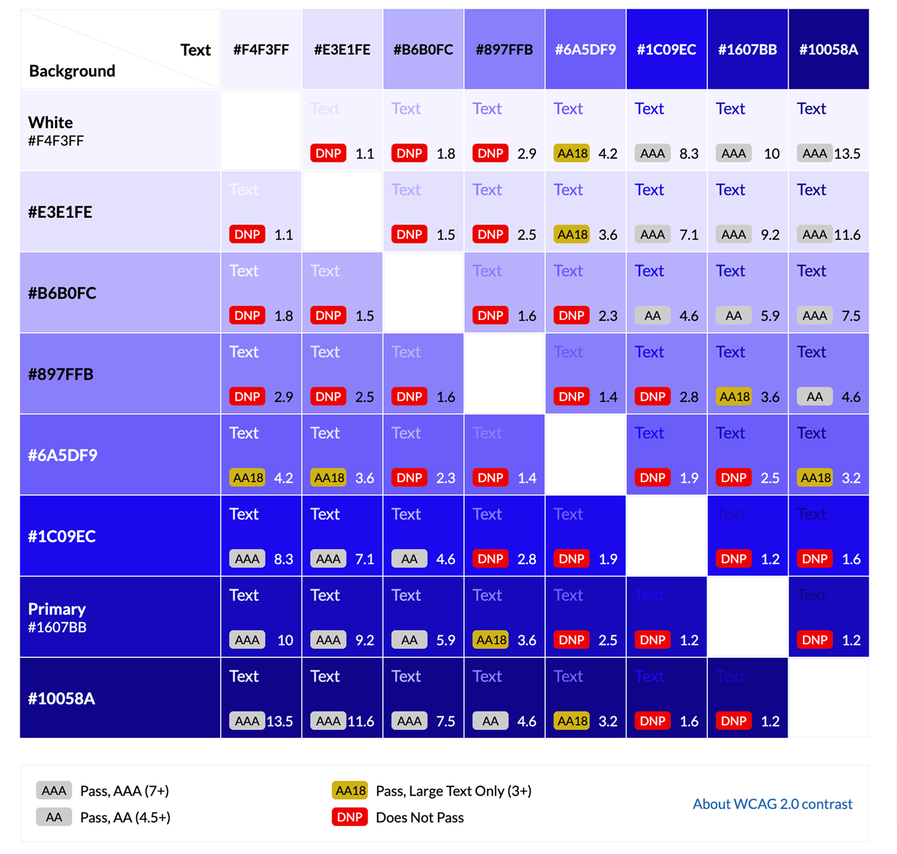
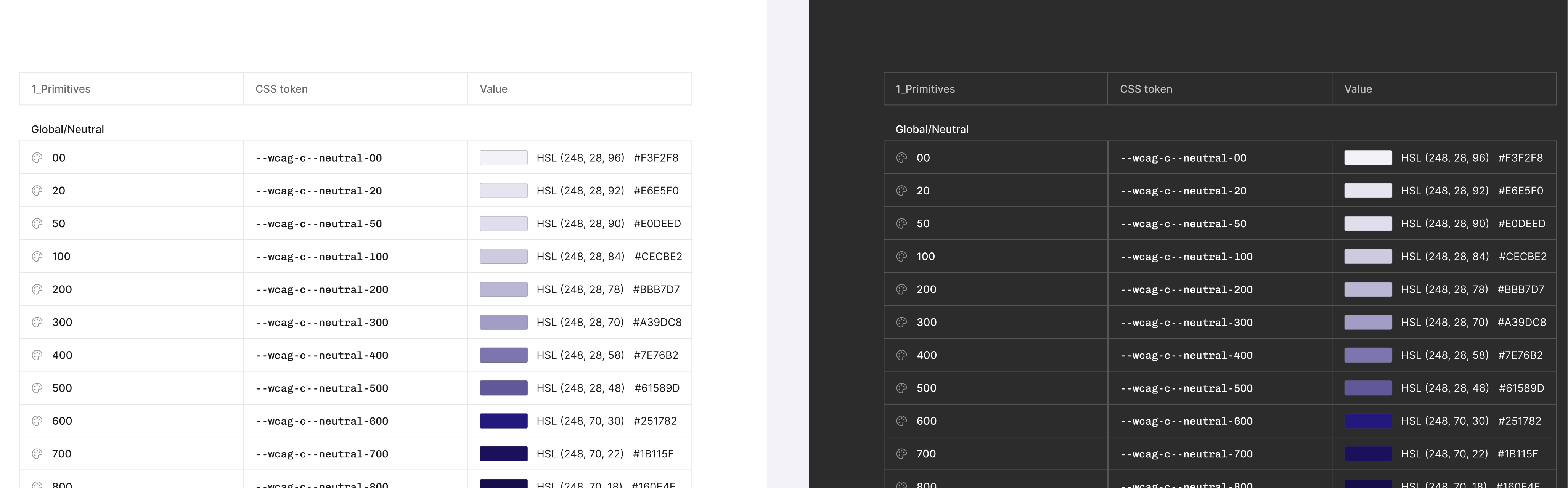
Colors
A11y-compliant palettes with clear contrast ratios. Semantic color tokens (e.g., primary, surface, danger) enable consistent theming across components
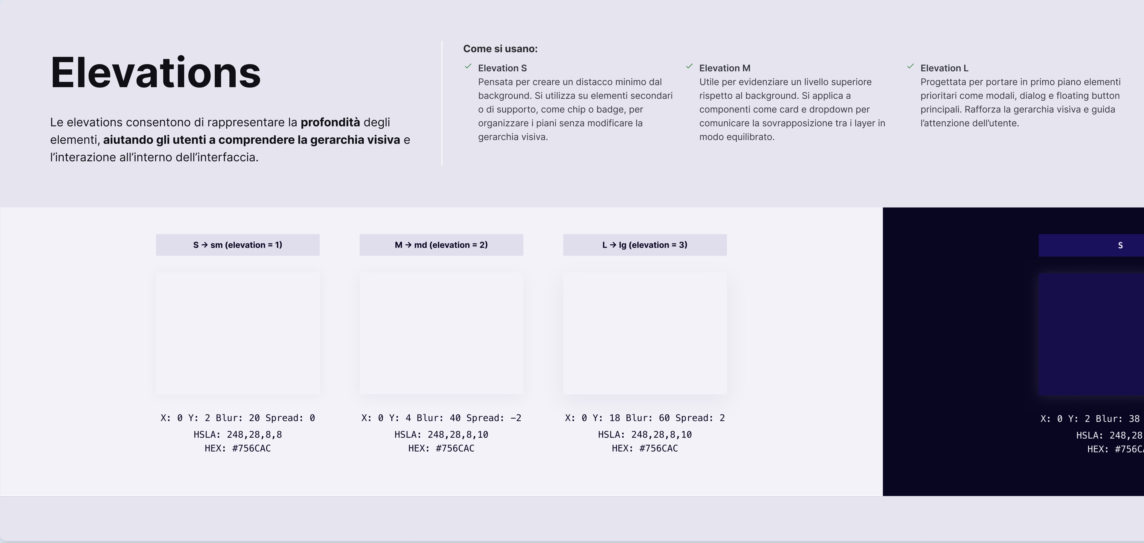
Elevations
Defined elevation tokens using layered shadows and z-index management, providing consistent depth and focus cues
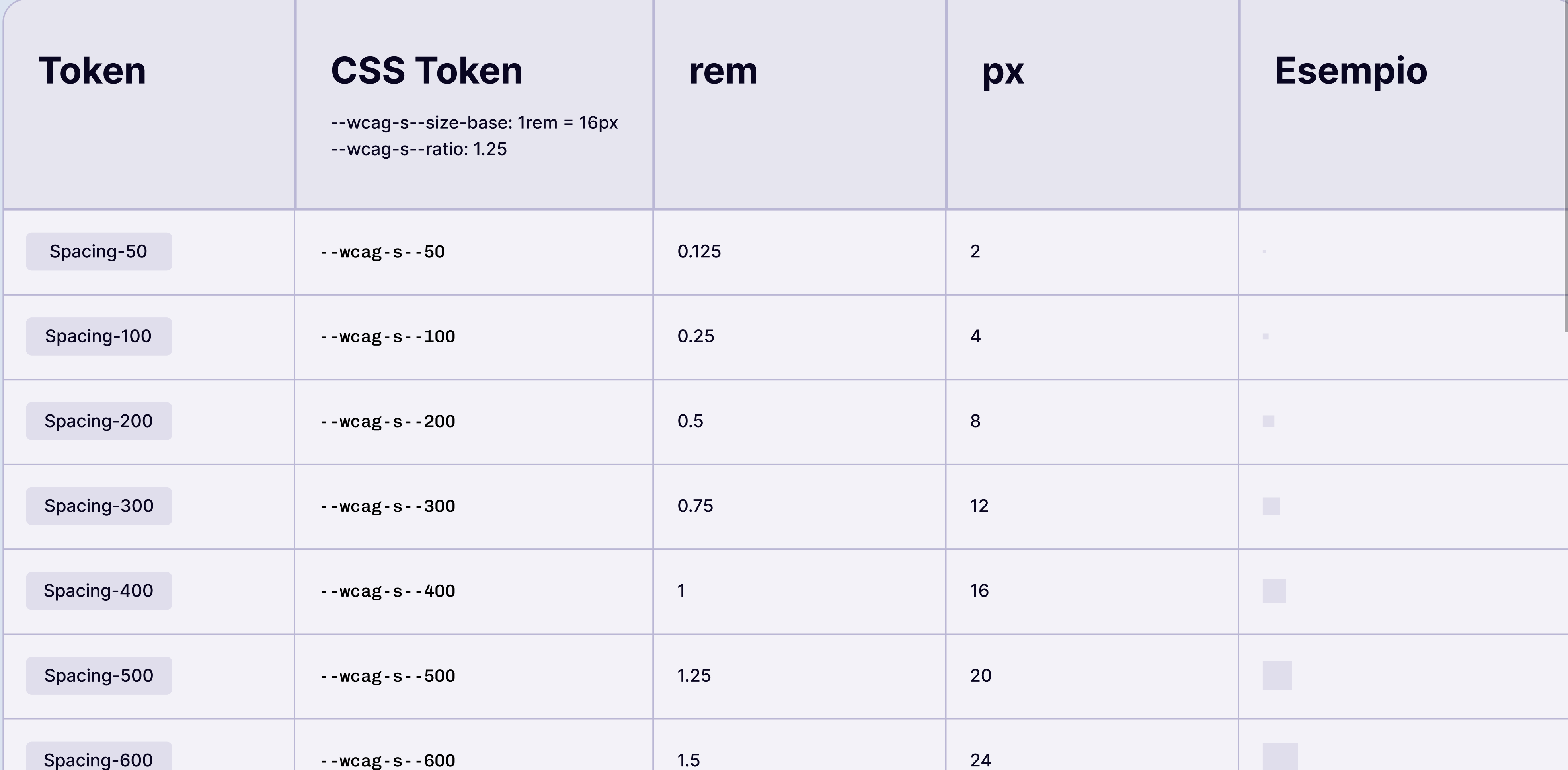
Spacings
An exponential spacing scale 4px based, enabling consistent paddings, margins, and layout rhythm
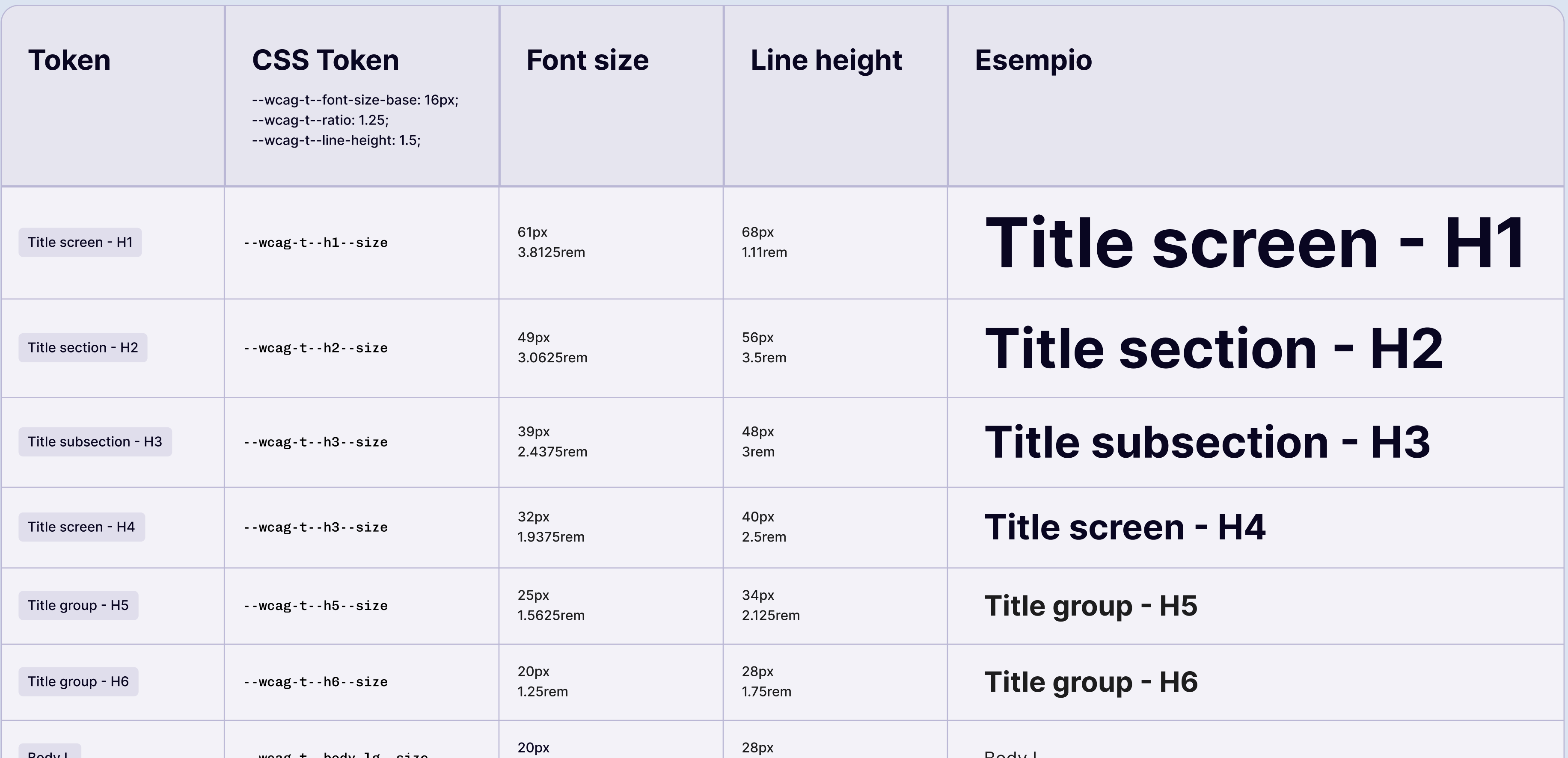
Typography
A readable type scale and fonts stack ensures readability across all devices
Components
Button
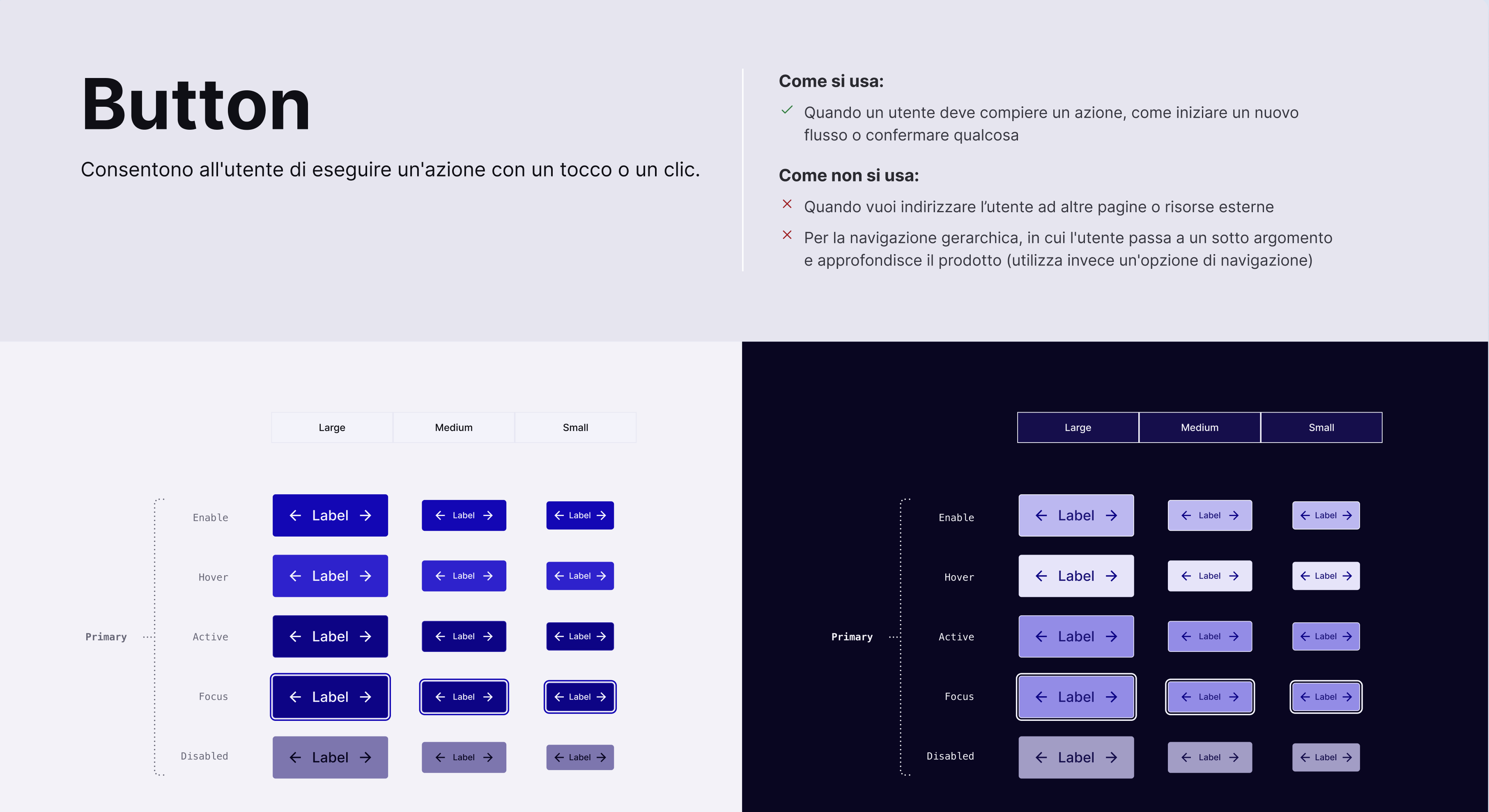
        <button is="wcag-button">
          Button
        </button>
        <button is="wcag-button" secondary>
          Button
        </button>
        <button is="wcag-button" tertiary>
          Button
        </button>
        <button is="wcag-button" destructive>
          Button
        </button>
Input
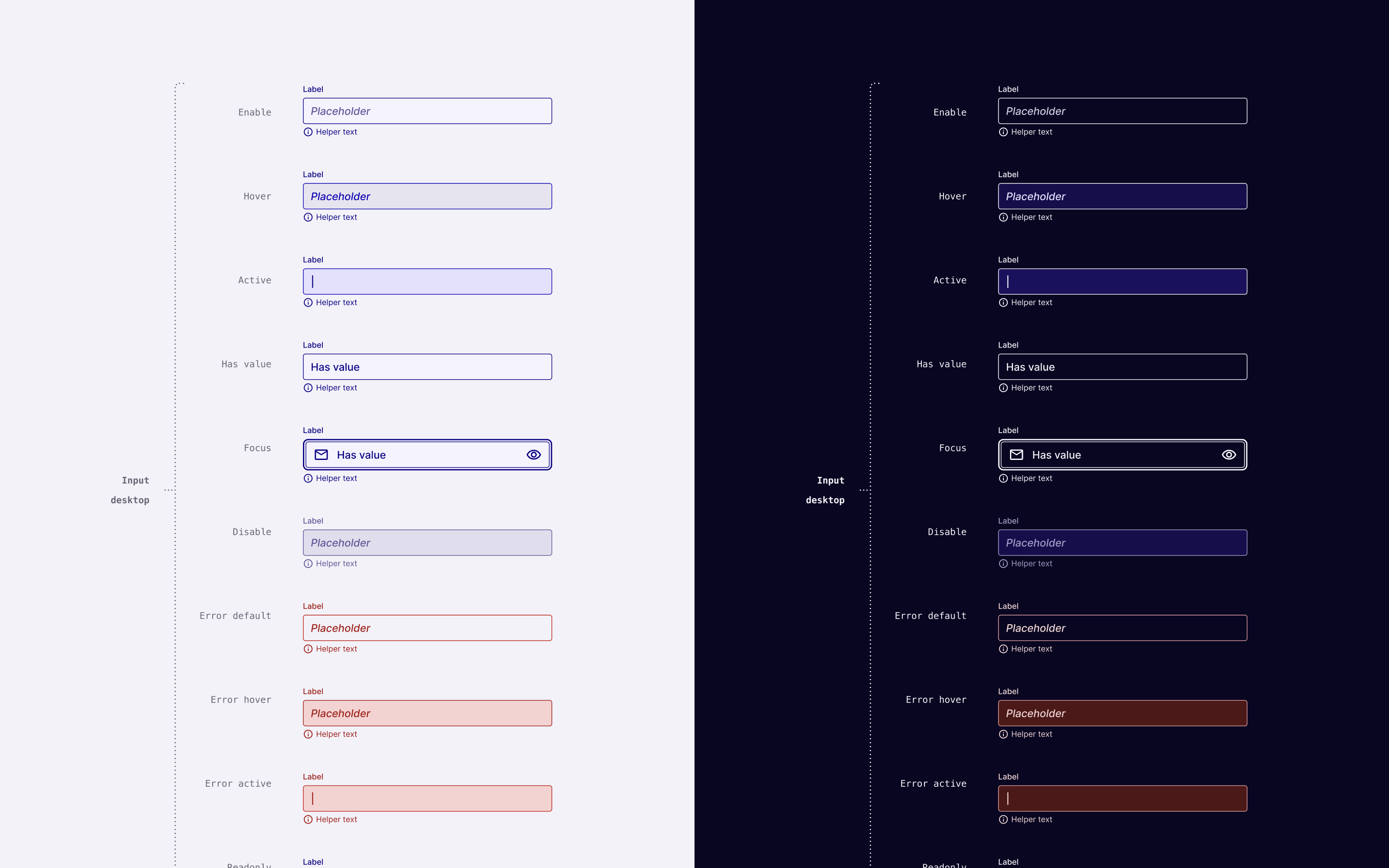
        <input is="wcag-input" name="username"
          type="text"
          aria-label="Username"
          placeholder="Enter your username..." />
        <label>
          Username
          <input is="wcag-input" name="username" type="text"
            placeholder="Enter your username..." />
        </label>
Select Dropdown
<select is="wcag-select"
name="options" aria-label="Options"
placeholder="Select an option"
>
</select>
Checkbox
        <input is="wcag-checkbox" name="accept"
          aria-label="Accept agreement" />
        <label>
          Accept agreement
          <input is="wcag-checkbox" name="accept"
            type="checkbox" />
        </label>
Radio
        <input is="wcag-radio" name="accept"
          aria-label="Accept agreement" />
        <label>
          Accept agreement
          <input is="wcag-radio" name="accept"
            type="radio" />
        </label>
Components Implemented
Button, Input, Textarea, Select, Checkbox, Radio, Switch, Details, Accordion, Dialog, Tooltips, Popovers,
Components Roadmap
Carousel, Calendar, DatePicker (single and range), DateTimePicker (single and range), ColorPicker (in RGB, HEX, HSL, OKLCH formats), Alert & Toast, Tabs & Stepper, and many many more...
Links

Slides Links


Links


Grazie ❤️!