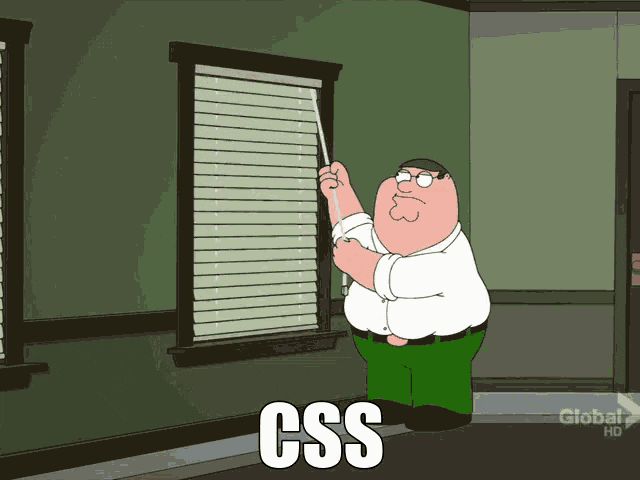
Modern (and hopefully Accessible) CSS Architecture
...with CSS Atomic APIs

Emiliano Pisu
Design Engineer,
Sensei & Co-Host
@ Dev Dojo IT
 linkedin.com/in/pixu1980
 github.com/pixu1980
 codepen.io/pixu1980
linkedin.com/company/dev-dojo-it/
 youtube.com/@devdojo_it
 twitch.tv/devdojo_it
 @devdojo_it
We can't talk about "architecture"
without talking about Design Systems
Is your Design System actually a System …or just a handful of ideas?
What is a Design System?
A Design System is a shared
language used to define and
collect a set of guidelines
A Design System is a
cultural infrastructure for the collaboration between teams
Why do we need an
Accessible Design System?
- Color contrasts and guidelines for visibility
- Spacing and grid systems for clear structure
- Typography and iconography for legibility
- Visual modes and responsive design guidelines
- Motion guidelines, with reduce motion fallbacks
What are we going to
talk about today?
Topics
- Lean Web
- Semantic HTML
- The Browser's hidden Design System
- classless CSS
Modern CSS
- --* Custom Properties
- @layer and layer()
- color-scheme and light-dark() function
- typed attributes
How are we going to feel
at the end of the day?
not like him...
... I'm promise 😄!!!
We can't talk about "architecture"
without talking about the Lean Web
The rules of Lean Web
#1 - You do not talk about Lean Web.#2 - You do NOT talk about Lean Web.
#3 - …

…just kidding 🤣!
#1 - Minimalism
Minimize the use of visual and architectural overhead, always following the paradigm
HTML 1st, CSS 2nd and JS 3rd
#1 - Minimalism
#2 - Adoption of the Platform
Learn to combine and make the most
of native APIs and methods of the core web technologies is simpler and more performant
than using external frameworks and libraries
#2 - Adoption of the Platform
See the Pen HTML + CSS accordion by pixu1980 (@pixu1980) on CodePen.
#3 - Inclusivity
(The Web is for Everyone!)
Creating inclusive applications means
guaranteeing a smooth experience for everyone:
for people with disabilities, or a slow
connection, or a low-powered device
#3 - Inclusivity
(The Web is for Everyone!)
See the Pen HTML + CSS accordion + JS for accessibility by pixu1980 (@pixu1980) on CodePen.
#4 - Sustainability and Performance
Every byte has an environmental cost!
We strive to reduce the energy consumption
of our products by optimizing resources and
reducing complexity; it is an ethical duty
and a necessity for the future of the web
The Browser’s Hidden
Design System
Semantic HTML is power
- Structure, meaning, and accessibility baked in
- Assistive technologies understands your layout
- HTML is a base component system providing accordions, dialogs, popovers and many more for free, make it yours!
Modern CSS evolving everyday
- Allows layering, nesting, scoping, targeting, transitioning (even between routes)
- User agents are improving at every release, and their default styles are converging over time
- Focus indicators and roles come out of the box, no JS needed for basic interactions
System Colors
Natively accessibile color palette derived from OS colors, reactive to system settings, including accent-color- Canvas
- CanvasText
- LinkText
- VisitedText
- ActiveText
- ButtonFace
- ButtonText
- ButtonBorder
- GrayText
- Field
- FieldText
- Highlight
- HighlightText
- Mark
- MarkText
- SelectedItem
- SelectedItemText
- AccentColor
- AccentColorText
- Canvas
- CanvasText
- LinkText
- VisitedText
- ActiveText
- ButtonFace
- ButtonText
- ButtonBorder
- GrayText
- Field
- FieldText
- Highlight
- HighlightText
- Mark
- MarkText
- SelectedItem
- SelectedItemText
- AccentColor
- AccentColorText
Type Scale & Spacings
Heading elements from <h1> to <h6>, paragraphs and all other phrasing elements follow a visual hierarchy, spacings reflect an implied scale and rhythmHeading 1
Heading 2
Heading 3
Heading 4
Heading 5
Heading 6
Paragraph
Focus Styles & User Input
Native UI elements that adapt to platform conventions, keyboard-focused elements get visible outlines out of the boxTakeaway
Don’t fight the browser anymore, embrace it!
A classless approach
CSS without classes?
What to use instead?
Semantics + Attribute Utilities
class selectors and attribute selectors
has the same specificity

Look... our HTML is already full of attributes, at least... it should be!
So why not use them for CSS selectors?
        <html data-theme="dark">
          <head></head>
          <body>
            <button disabled aria-label="Close modal">x</button>

            <input type="email" required placeholder="Your email" />

            ...
          </body>
          <style>
            [data-theme*="dark"] { ... }
            [aria-label] { ... }
            [type="email"] { ... }
          </style>
        </html>
CSS attr() function allows to get the value of an HTML attribute as a string
        <div title="This is the title"></div>

        <style>
          div::after {
            content: attr(title);
          }
        </style>
Unfortunately, this was traditionally limited to the CSS content property
Do you know CSS attr() function is about to get a game-changer update?
What's new with attr() function?
        <element attr="value"></element>

        <style>
          element {
            property: attr(attr type(<type>), fallback-value);
          }
        </style>
Example: Grid Control
        <div column-start="1" column-end="3">
          this is the div content
        </div>

        <style>
          div {
            grid-column-start: attr(column-start type(<integer>), 1);
            grid-column-end: attr(column-end type(<integer>), -1);
          }
        </style>
Use attr() to control grid layout via HTML attributes
Example: Dynamic Font Sizes & Colors
        <div font-size="5em" text-color="rebeccapurple">
          Hello World!
        </div>

        <style>
          div {
            font-size: attr(font-size type(<length>), 1em);
            color: attr(text-color type(<color>), black);
          }
        </style>
Set font size, colors (or whatever) dynamically using attributes
Better to use data-* attributes?
-
Virtually prevents conflicts with
"standard" attributes -
Provides a clear namespace for
custom stuff -
Accessible via JavaScript through
the dataset API
CSS Custom Properties are supported as well
        <button data-color="rebeccapurple">
          Click me!
        </button>

        <style>
          button[data-color] {
            --button-color: attr(data-color type(<color>), Canvas);

            background-color: var(--button-color);
          }
        </style>
Pass
attribute values to custom properties for broader usage
Supported types include: angle, color, custom-ident, image, integer, length, length-percentage, number, percentage, resolution, string, time, transform-function...
...unlocking infinite possibilities with typed attributes:
-
DOM based control
(for theming, variants, sizing, visibility) - Custom logic baked into selectors
- No spaghetti css classes
- Reduce visual noise in markup
Takeaway
We’re entering an era where HTML attributes will become the new interface for UI logic, and CSS will finally treat them as first-class citizens.
Popular Classless Frameworks
- Pico.css - beautiful defaults & theming
- Water.css - zero-config elegance
- Almond.css - opinionated and light
Examples
Come to the light-dark() side!

color-scheme and light-dark()
@layer (MDN docs)
Fully supported across browsers
since May 2024
light-dark()
<meta name="color-scheme" content="light dark" />
      :root {
        color-scheme: light dark;
        /* color-scheme: light; */ /* forcing light color scheme */
        /* color-scheme: dark; */ /* forcing dark color scheme */
      }

      body {
        color: light-dark(#fefefe, #202020);
      }
CSS Custom Properties
--* (MDN docs)
Introduced by Firefox in July 2014,
and fully supported across browsers
since April 2017
Centralizing values
:root {
  --text-color: #34eadb;
  --font-size: 16px;
}

body {
  color: var(--text-color);
  font-size: var(--font-size);
}
Flowing with the cascade
:root {
  --text-color: #34eadb;
  --font-size: 16px;
}

body {
  --font-size: 18px;

  color: var(--text-color);
  font-size: var(--font-size);
}
Dynamic and Conditional overrides...
:root {
  --text-color: light-dark(#202020, #efefef);
  --background-color: light-dark(#efefef, #202020);
}

body {
  color: var(--text-color);
  background-color: var(--background-color);
}
...the same goes for Responsive
:root {
  --padding: 8px;
}

@media (min-width: 600px) {
  :root {
    --padding: 16px;
  }
}

.container {
  padding: var(--padding);
}
CSS Layers
@layer (MDN docs)
Introduced by Firefox in February 2022,
and fully supported across browsers
since March 2022
CSS Layers Example
@layer reset, layout, components;

@layer reset {
  * {
    box-sizing: border-box;
    ...
  }
}

@layer components {
  button {
    border-size: 1px solid lightgray;
  }
}

@layer layout {
  body {
    display: grid;
    grid-template-areas:
      'header header'
      'aside main'
      'footer footer';
  }
}
Layers depths levels
@layer ui {
  @layer button {
    :root {
      --button--font-size: 18px;
    }

    button {
      font-size: var(--button--font-size);
    }
  }

  @layer input {
    :root {
      --input--font-size: 20px;
    }

    input {
      font-size: var(--input--font-size);
    }
  }
}
That's awesome, but ...
... what about old CSS codebase
and un-layered third-party deps?
The layer() function will be
your best friend
@import ... layer() pattern
@import 'path-to-old-dependency.css' layer(old);
@import 'path-to-old-dependency.theme.css' layer(old.theme);
@import 'path-to-other-old-dependency.css' layer(old.other);

@layer new-library {
  ...
}

// un-layered code
Reverse Cascade
Which --ui--font--size wins?
:root {
  --ui--font-size: 10px;
}

@layer ui {
  :root {
    --ui--font-size: 16px;
  }

  @layer button {
    :root {
      --ui--font-size: 18px;
    }

    button {
      font-size: var(--ui--font-size);
    }
  }
}
Look at me Ma'...
I'm reversing waterfalls
So CSS layers are actually
breaking the cascade?
Absolutely not!
They're actually flowing
with the cascade.
The C in CSS
The Cascade is an algorithm that defines how user agents combine property values originating from different sources. MDN
How the cascade algorithm handles the precedence of declarations?
- user-agent declarations
- user declarations
- author and inline declarations
- @keyframe animations
- !important 😞 author and inline declarations
- !important 😢 user declarations
- !important 😭 user-agent declarations
- transitions
How the @layer
integrates into this?
- @layer 1 declarations
- @layer ... declarations
- @layer N declarations
- un-layered declarations
- inline declarations
What about
@layer and !important?
- !important 😟 un-layered declarations
- !important 😞 @layer N declarations
- !important 😖 @layer ... declarations
- !important 😫 @layer 1 declarations
- !important 😢 inline declarations
So in the end...
Order of precedence (lower to higher priority)
- user-agent declarations
- user declarations
-
author declarations
- @layer 1 declarations
- @layer ... declarations
- @layer N declarations
- un-layered declarations
- inline declarations
- @keyframe animations
-
!important 😟 author and inline declarations
- !important 😞 un-layered declarations
- !important 😖 @layer N declarations
- !important 😫 @layer ... declarations
- !important 😢 @layer 1 declarations
- !important 😭 inline declarations
- !important 😡 user declarations
- !important 🤬 user-agent declarations
- transitions
Extending and breaking down
Atomic Design (by Brad Frost)
Its principles takes cues from the chemistry itself

Let's seed a Design System
with Atomic APIs
the seed
@layer design-system {
  /* here goes the design system css code */

  @layer reset {
    * {
      box-sizing: border-box;
      ...
    }
  }

  @layer motion {
    :root {
      --ds--m--animation-speed: .25s;
      --ds--m--animation-speed--reduce: .15s;

      --ds--m--animation-easing: ease-in-out;
      --ds--m--animation-easing-reduce: linear;
    }

    /* Default animation */
    @keyframes myAwesomeAnimation {
      0% { transform: translateX(0); opacity: 0; }
      50% { transform: translateX(100px); opacity: 0.5; }
      100% { transform: translateX(0); opacity: 1; }
    }

    .element {
      animation-name: myAwesomeAnimation;
      animation-duration: var(--ds--m--animation-speed);
      animation-timing-function: var(--ds--m--animation-easing);
    }

    /* Simpler animation for reduced motion preference */
    @media (prefers-reduced-motion: reduce) {
      @keyframes myAwesomeAnimation {
        0% { opacity: 0; }
        100% { opacity: 1; }
      }

      .element {
        animation-name: myAwesomeAnimation;
        animation-duration: var(--ds--m--animation-speed--reduce);
        animation-timing-function: var(--ds--m--animation-easing--reduce);
      }
    }
  }

  ...
}

/*
here goes the application/project specific
code and design system overrides
*/
Un-packing Atoms
Neutrons: Spacing, Radius, Grid System
@layer design-system {
  ...

  @layer neutrons {
    :root {
      /* here goes the neutrons common variables */
    }

    @layer spacings {
      :root {
        --ds--s--xxs: 0.4rem;
        --ds--s--sx: 0.8rem;
        --ds--s--sm: 1.2rem;
        --ds--s--md: 1.5rem;
        --ds--s--lg: 2rem;
        --ds--s--xl: 2.4rem;
        --ds--s--xxl: 3.2rem;

        ...
      }
    }

    @layer radius {
      :root {
        --ds--r--xxs: 0.4rem;
        --ds--r--sx: 0.8rem;
        --ds--r--sm: 1.2rem;

        ...
      }
    }

    @layer grid-system {
      :root {
        --ds--gs--container--size: 100vw;
        --ds--gs--container--gap: 1.5rem;
        --ds--gs--cols: 12;
        --ds--gs--gap: 1.5rem;
        --ds--gs--v-gap: 1.5rem;
      }

      @layer container {
        [container] {
          gap: var(--ds--gs--container--gap);
          inline-size: var(--ds--gs--container--size);
          flex-flow: column;
          block-size: auto;
          margin: 0 auto;
          padding: 0;
          display: flex;

          &[fluid] {
            --ds--gs--container--size: 100%;
          }
        }

        @layer breakpoints {
          @media screen and (width >= 414px) {
            :root {
              --ds--gs--container--size: 375px;
            }
          }

          @media screen and (width >= 576px) {
            :root {
              --ds--gs--container--size: 540px;
            }
          }

          ...

          @media screen and (width >= 1920px) {
            :root {
              --ds--gs--container--size: 1600px;
            }
          }
        }
      }

      @layer row {
        [row] {
          grid-template-columns: repeat(var(--ds--gs--cols), 1fr);
          gap: var(--ds--gs--v-gap) var(--ds--gs--gap);
          grid-template-rows: auto;
          grid-auto-flow: row;
          inline-size: 100%;
          margin: 0;
          display: grid;
        }
      }

      @layer column {
        [col] {
          grid-column: auto / span var(--ds--gs--cols);
          max-inline-size: var(--ds--gs--container--size);
          border: 1px solid red;
          flex-flow: column;
          display: flex;
        }

        @layer sizes {
          [col] {
            &[size~="1"] {
              grid-column-end: span 1;
            }

            &[size~="2"] {
              grid-column-end: span 2;
            }

            ...

            &[size~="12"] {
              grid-column-end: span 12;
            }
          }

          @media screen and (width >= 414px) {
            [col] {
              &[size~="xs-1"] {
                grid-column-end: span 1;
              }

              ...

              &[size~="xs-12"] {
                grid-column-end: span 12;
              }
            }
          }

          ...

          @media screen and (width >= 1920px) {
            [col] {
              &[size~="xxl-1"] {
                grid-column-end: span 1;
              }

              ...

              &[size~="xxl-12"] {
                grid-column-end: span 12;
              }
            }
          }
        }
      }
    }
  }

  ...
}
Electrons: Typography and Iconography
@layer design-system {
  ...

  @layer electrons {
    :root {
      /* here goes the electrons common variables */
    }

    @layer typography {
      :root {
        --ds--t--ratio: 1.125; /* major second */
        --ds--t--font-size--base: 1.6rem;

        --ds--t--line-height--base: 1.5;

        --ds--t--font-weight: 400;
        --ds--t--font-style: normal;
        --ds--t--letter-spacing: initial;
        --ds--t--text-decoration: none;
      }

      html {
        /*
          16px/10px = 0.625, expressed in em
          makes the font-size reactive to browser settings
          and makes 1rem = 10px,
          allowing to use rems as a simple division base-10 value
        */
        font-size: 0.625em;
      }

      body {
        /* resets the base content font-size to 1.6rem = 16px */
        --ds--t--font-size: var(--ds--t--font-size--base);
        --ds--t--line-height: var(--ds--t--line-height--base);

        font-family: var(--ds--t--font-family);
        font-size: var(--ds--t--font-size);
        line-height: var(--ds--t--line-height);
        font-weight: var(--ds--t--font-weight);
        font-style: var(--ds--t--font-style);
        letter-spacing: var(--ds--t--letter-spacing);
        text-decoration: var(--ds--t--text-decoration);

        :where(*) {
          --ds--t--font-size: var(--ds--t--font-size--base);
          --ds--t--line-height: var(--ds--t--line-height--base);

          font-family: var(--ds--t--font-family);
          font-size: var(--ds--t--font-size);
          line-height: var(--ds--t--line-height);
          font-weight: var(--ds--t--font-weight);
          font-style: var(--ds--t--font-style);
          letter-spacing: var(--ds--t--letter-spacing);
          text-decoration: var(--ds--t--text-decoration);
        }

        h1 {
          --ds--t--font-size: calc(1em * pow(var(--ds--t--ratio), 6));
        }

        h2 {
          --ds--t--font-size: calc(1em * pow(var(--ds--t--ratio), 5));
        }

        h3 {
          --ds--t--font-size: calc(1em * pow(var(--ds--t--ratio), 4));
        }

        h4 {
          --ds--t--font-size: calc(1em * pow(var(--ds--t--ratio), 3));
        }

        h5 {
          --ds--t--font-size: calc(1em * pow(var(--ds--t--ratio), 2));
        }

        h6 {
          --ds--t--font-size: calc(1em * pow(var(--ds--t--ratio), 1));
        }

        :where(h1, h2, h3, h4, h5, h6) {
          --ds--t--font-weight: 700;
        }

        :where(h1, h2, h3, h4, h5, h6, p, ul, ol, pre) {
          margin: 0;

          + & {
            margin-block-start: var(--ds--spacings--md);
          }
        }

        li + li {
          margin-block-start: calc(var(--ds--spacings--md) / 2);
        }

        a {
          --ds--t--text-decoration: underline;

          &:hover {
            --ds--t--text-decoration: none;
          }
        }
      }
    }

    @layer iconography {
      /* iconography variables and classes,
        e.g. icomoon.io/app */
    }

  }

  ...
}
Protons: Colors, Focus, Elevations
@layer design-system {
  ...

  @layer protons {
    :root {
      /* here goes the protons common variables */
    }

    @layer colors {
      :root {
        /* neutral colors - same in light and dark modes */
        --ds--c--n-100: hsl(248, 28%, 84%);
        --ds--c--n-200: hsl(248, 28%, 78%);
        --ds--c--n-300: hsl(248, 28%, 70%);
        --ds--c--n-400: hsl(248, 28%, 58%);
        --ds--c--n-500: hsl(248, 28%, 48%);
        --ds--c--n-600: hsl(248, 70%, 30%);
        --ds--c--n-700: hsl(248, 70%, 22%);
        --ds--c--n-800: hsl(248, 70%, 14%);
        --ds--c--n-900: hsl(248, 70%, 8%);

        /* blue */
        --ds--c--b-100: light-dark(
          hsl(245, 94%, 98%),
          hsl(245, 73%, 98%)
        );

        --ds--c--b-200: light-dark(
          hsl(245, 94%, 94%),
          hsl(245, 73%, 94%)
        );

        --ds--c--b-300: light-dark(
          hsl(245, 94%, 84%),
          hsl(245, 73%, 84%)
        );

        --ds--c--b-400: light-dark(
          hsl(245, 94%, 74%),
          hsl(245, 73%, 74%)
        );

        ...

        /* high contrast preference */
        @media (prefers-contrast: more) {
          :root {
            /* redefine here color variables
              for the high contrast */
          }
        }

        /* low contrast preference */
        @media (prefers-contrast: less) {
          :root {
            /* redefine here color variables
              for the low contrast */
          }
        }
      }
    }

    @layer focus {
      :root {
        --ds--f--size: 3px;
        --ds--f--style: solid;
        --ds--f--color: var(--ds--c--n-400);
        --ds--f--offset: var(--ds--f--size);
        --ds--f--radius: var(--ds--r--xxs);
      }

      :focus-visible {
        outline: var(--ds--f--size) var(--ds--f--style) var(--ds--f--color);
        outline-offset: var(--ds--f--offset);
        border-radius: var(--ds--f--radius);
      }

      ...
    }

    @layer elevations {
      :root {
        /* basic shadow colors */
        --ds--e--shadow-color-1: light-dark(
          var(--ds--c--n-100),
          var(--ds--c--n-500)
        );

        --ds--e--shadow-color-2: light-dark(
          var(--ds--c--n-500),
          var(--ds--c--n-900)
        );

        /* xxs, usually for user input elements
          (inputs, selects, textareas, ...) */
        --ds--e--100:
          0 0 3px -1px var(--ds--e--shadow-color-1);

        /* xs, usually for elements closest to the application
          background, for example cards */
        --ds--e-200:
          0 0 5px 2px var(--ds--e--shadow-color-1),
          0 0 5px -2px var(--ds--e--shadow-color-2);

        ...

        /* xl, usually for elements highest in the stacking order,
          for example notifications and toasts,
          which should be above all other content */
        --ds--e-600:
          0 4px 24px -3px var(--ds--e--shadow-color-1),
          0 18px 64px -8px var(--ds--e--shadow-color-2);
      }
    }

    ...
  }
}
Atoms: The Building Blocks
@layer design-system {
  ...

  @layer atoms {
    :root {
      /* common components variables */
    }

    @layer button {
      :root {
        --ds--c-btn--padding-inline: var(--ds--s--md);
        --ds--c-btn--border-size: 1px;
        --ds--c-btn--border-style: solid;
        --ds--c-btn--border-color: var(--ds--c--b-200);
        --ds--c-btn--border-radius: var(--ds--r--xxs);
      }

      button {
        padding-inline: var(--ds--c-btn--padding-inline);
        border-size: var(--ds--c-btn--border-size);
        border-style: var(--ds--c-btn--border-style);
        border-color: var(--ds--c-btn--border-color);
        border-radius: var(--ds--c-btn--border-radius);
      }
    }

    @layer input {
      /* input component variables and styles */
    }

    @layer select {
      /* select component variables and styles */
    }

    ...
  }

  ...
}
Molecules: Composed but Cohesive
@layer design-system {
  ...

  @layer molecules {
    :root {
      /* here goes the molecules common variables */
    }

    @layer accordion {
      :root {
        --ds--c-acc--gap: var(--ds--s--md);

        --ds--c-acc--padding-inline: var(--ds--s--md);
        --ds--c-acc--border-size: 1px;
        --ds--c-acc--border-style: solid;
        --ds--c-acc--border-color: var(--ds--c--b-200);
        --ds--c-acc--border-radius: var(--ds--r--xxs);
      }

      [accordion] {
        display: flex;
        flex-flow: column nowrap;
        gap: var(--ds--c-acc--gap);

        padding-inline: var(--ds--c-acc--padding-inline);
        border-size: var(--ds--c-acc--border-size);
        border-style: var(--ds--c-acc--border-style);
        border-color: var(--ds--c-acc--border-color);
        border-radius: var(--ds--c-acc--border-radius);
      }
    }

    @layer date-picker {
      /* date-picker component variables and styles */
    }

    @layer dialog {
      /* dialog component variables and styles */
    }
  }

  ...
}
Organisms: Complex, Functional Units
@layer design-system {
  ...

  @layer organisms {
    :root {
      /* here goes the organisms common variables */
    }

    @layer search {
      /*
        <label>
          Search
          <span field-container>
            <input type="search" aria-label="Search"
              placeholder="Type you search query here..." />
            <button>🔍</button>
          </span>
        </label>
      */

      :root {
        --ds--c-src--direction: column;
        --ds--c-src--place-content: start;
        --ds--c-src--place-items: start;
        --ds--c-src--gap: var(--ds--s--sm);

        --ds--c-src--container--direction: column;
        --ds--c-src--container--place-content: start;
        --ds--c-src--container--place-items: start;
        --ds--c-src--container--gap: var(--ds--s--sm);

        --ds--c-src--container--border-size: 1px;
        --ds--c-src--container--border-style: solid;
        --ds--c-src--container--border-color: var(--ds--c--n-700);
        --ds--c-src--container--border-radius: var(--ds--r--xxs);
      }

      label:has([type="search"]) {
        display: inline-flex;
        flex-flow: var(--ds--c-src--direction) nowrap;
        place-content: var(--ds--c-src--place-content);
        place-items: var(--ds--c-src--place-items);
        gap: var(--ds--c-src--gap);

        [field-container] {
          display: inline-flex;
          flex-flow: var(--ds--c-src--container--direction) nowrap;
          place-content: var(--ds--c-src--container--place-content);
          place-items: var(--ds--c-src--container--place-items);
          gap: var(--ds--c-src--container--gap);
        }

        :where(input, button) {
          border-size: var(--ds--c-src--container--border-size);
          border-style: var(--ds--c-src--container--border-style);
          border-color: var(--ds--c-src--container--border-color);
        }

        input {
          border-top-left-radius: var(--ds--c-src--container--border-radius);
          border-bottom-left-radius: var(--ds--c-src--container--border-radius);
        }

        button {
          border-top-right-radius: var(--ds--c-src--container--border-radius);
          border-bottom-right-radius: var(--ds--c-src--container--border-radius);
        }
      }
    }

    ...
  }

  ...
}
That's It! Atomic CSS APIs
are now ready to use...
...layered selectors and values can be easily overridden by un-layered ones
Overriding example
@layer design-system {
  ...

  @layer molecules {
    ...
  }

  ...
}

:root {
  --ds--c--dark: #202020;
  --ds--c--light: #fefefe;

  --ds--e--shadow-color-1: hsla(210, 3%, 36%, 0.16);
  --ds--e--shadow-color-2: hsla(213, 5%, 42%, 0.38);

  --ds--t--font-size: 2.2rem;
  --ds--t--line-height: 1.25;

  ...
}
Let's take a look at the
pixCSS example
An Awesome CSS Link a Day

Slides

Slides Repo

Grazie ❤️!